Student portal redesign
Before & After
New branding predicted another palette of greens. It is also noticeably more robust, sharp, and futuristic in typeface and logo, placing clear emphasis on the "Technical" aspect in both the university’s name and its purpose. When making design decisions, I established three main tones of green to create depth across layouts, and I used the primary green to highlight headlines, key content, and the most important CTAs.
Grades, at a glance — not buried in a spreadsheet.
Before, grades lived in a bare data table with no aggregation, no visual pattern, and often no data at all — many professors kept their own grade records in personal Excel sheets or self-coded mini-sites, since the platform never gave them a real alternative. Students had no single source of truth, and no way to see their standing without doing the math themselves.
I designed a dedicated grades dashboard: a weighted average surfaced as a hero number, a color-coded distribution plot so patterns are visible at a glance, and running totals for completed courses and earned credits. The course list below stays detailed — exam type, date, grade, retake link — but now it's grouped and scannable instead of a wall of near-empty rows.
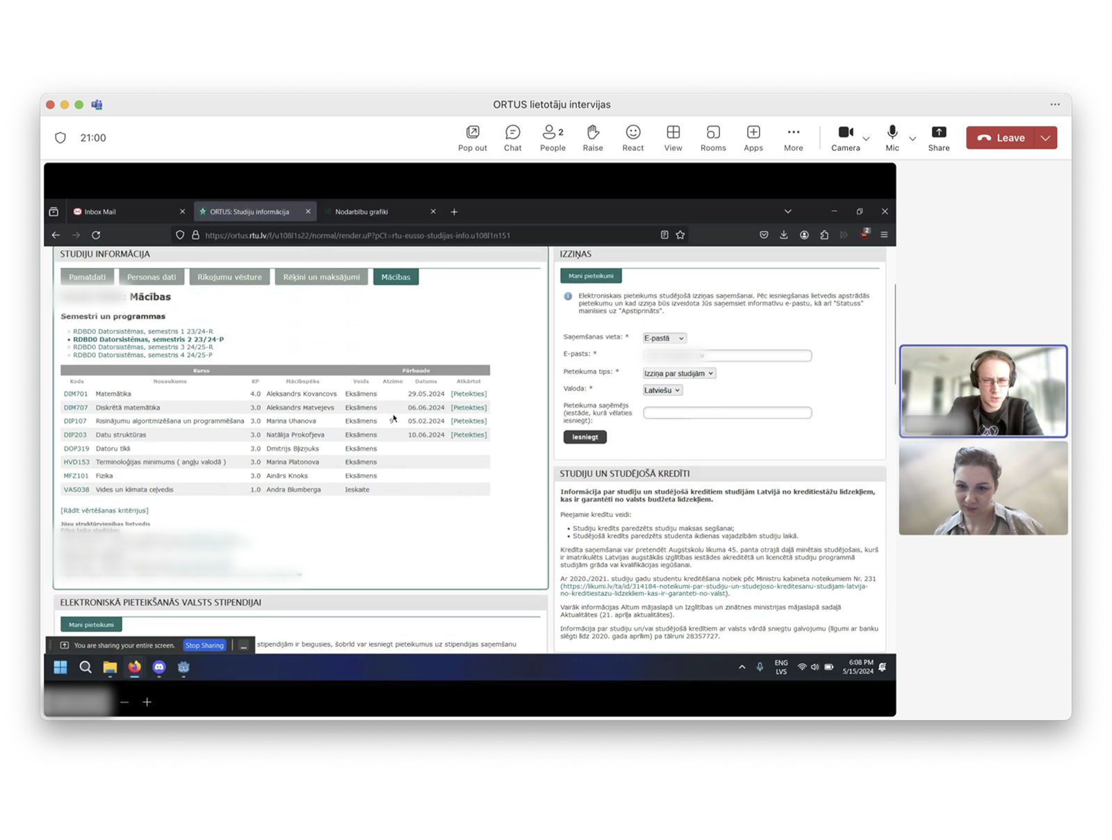
before | Live user interview mapping the way to see grades table on the left area of the interface
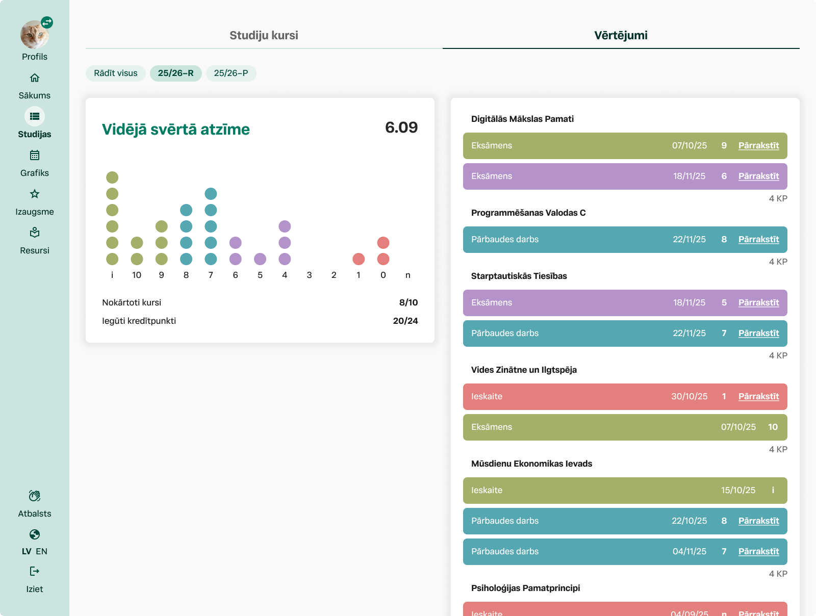
after | Look into grades section on desktop
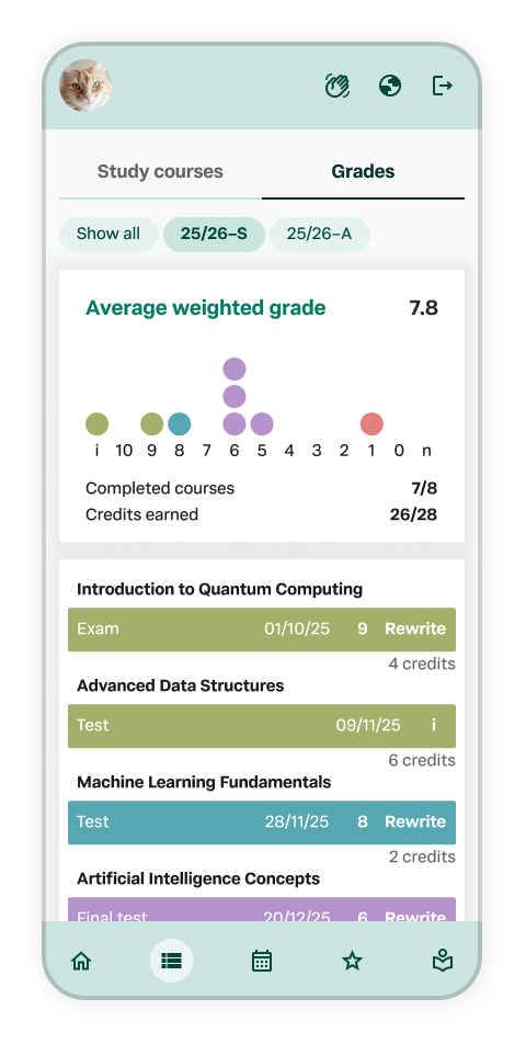
after | Look into grades section on mobile
From a dense grid to a schedule you can actually scan.
The old schedule packed every class into one crowded monthly cell — no color-coding, no way to spot an exam at a glance, and no mobile support at all.
I made multi-view calendar system and split it into three coordinated views: a day view, a full week grid for planning ahead, and a mini-calendar with color-coded dot indicators — red for change, light green for regular classes, dark green for exams and tests — so students can spot a heavy week before ever opening it. Courses are color-coded, exams are visually distinguished throughout, and the academic year calendar now lives as a persistent reference at the bottom, instead of being buried on a separate page.
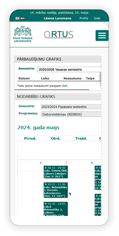
before | scheduled classes viewed on mobile, unresponsive table, inaccessible layout
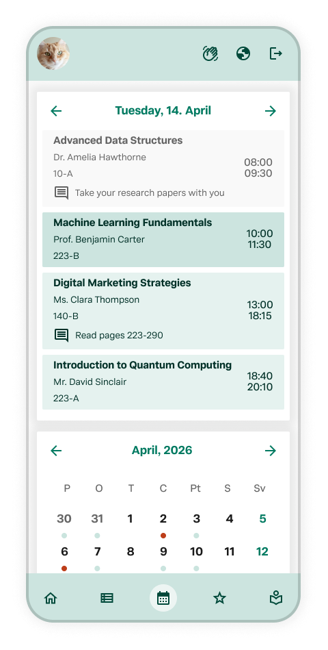
after | on small screens first you see classes in the day view
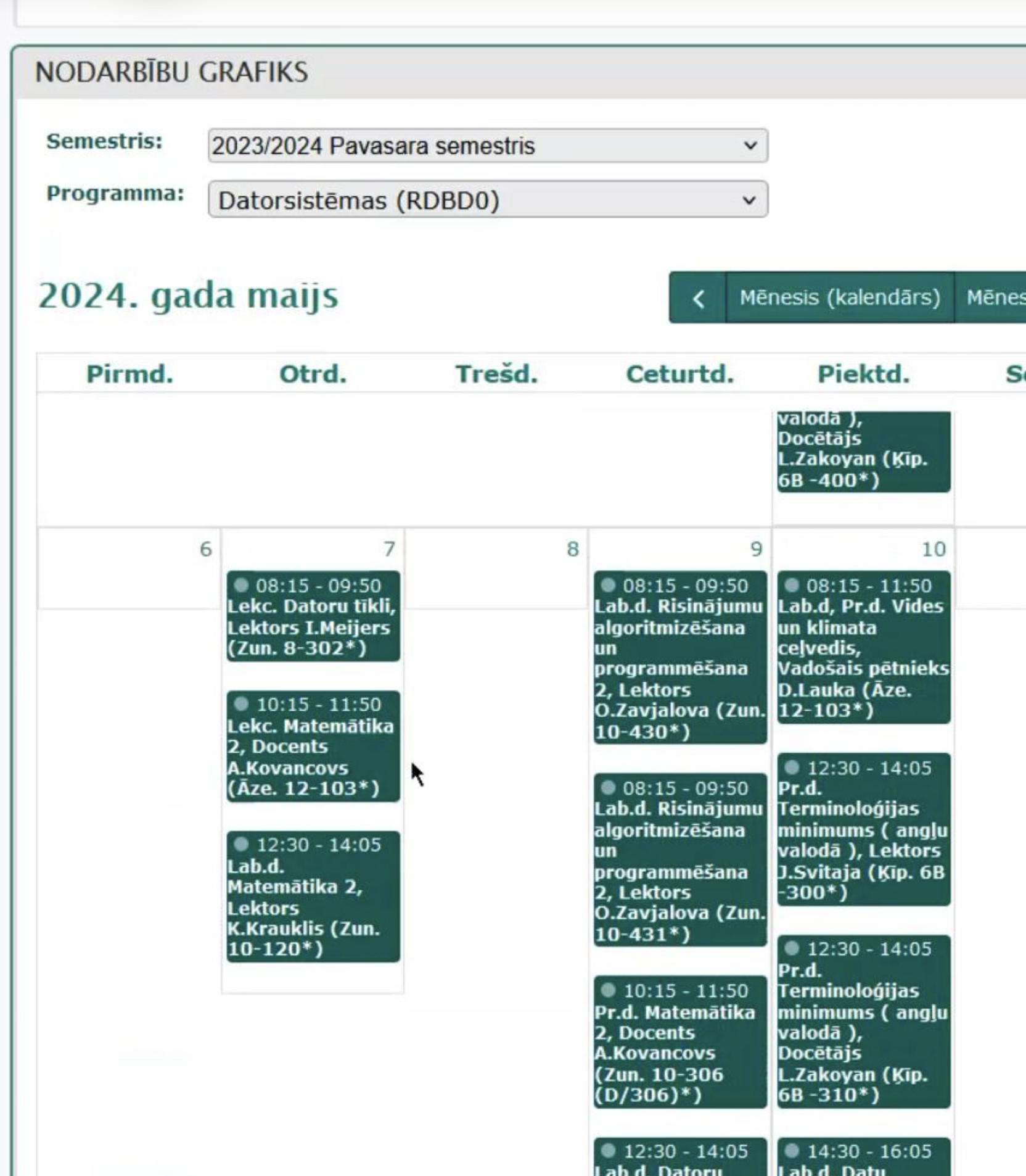
before | scheduled classes section on large screens
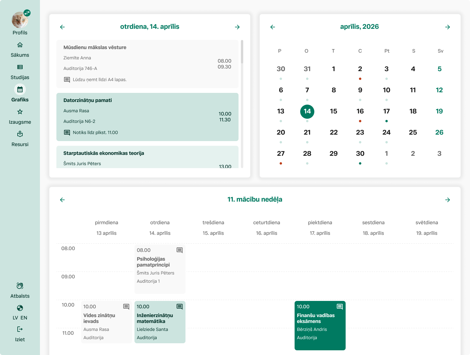
after | multi-view calendar system on desktop
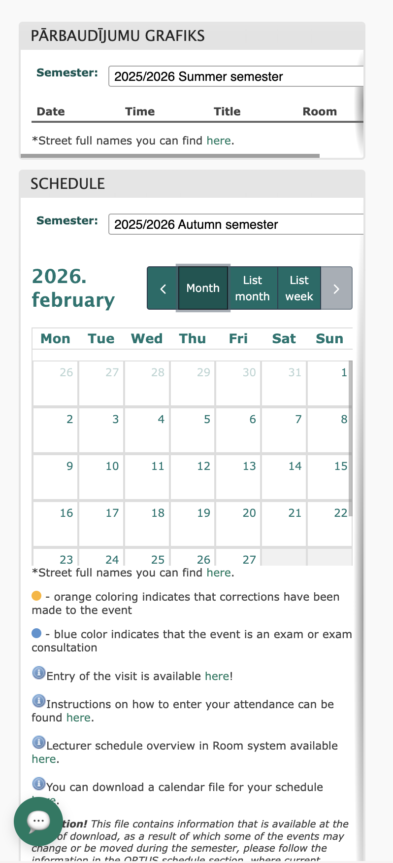
before | scheduled classes viewed on mobile
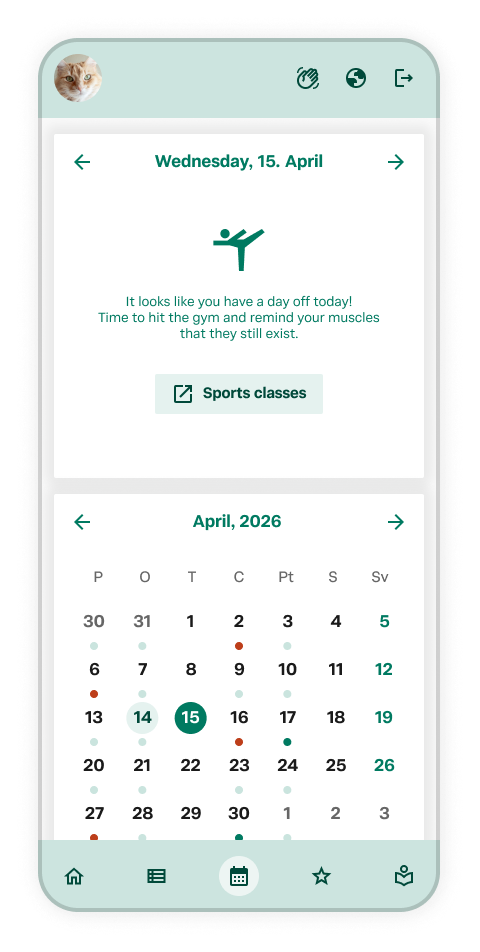
after | a fun way to spend a day-off suggestion
From a bolted-on catalog to a native search experience.
The old library page treated PRIMO — the university's actual search catalog — as an external tool, tucked into a promotional sidebar box next to a wall of unrelated links and a broken widget throwing raw system errors. Reading-room access, book search, and librarian contact all lived in different corners of a cluttered, tab-heavy interface.
I removed the legacy system entirely and rebuilt the library experience around PRIMO as the primary search, front and center. Reading-room access is now one clear card — location, requirements, and consent in a single flow — and even system notices (like a missing student ID) are communicated as plain, actionable messages instead of raw backend errors.
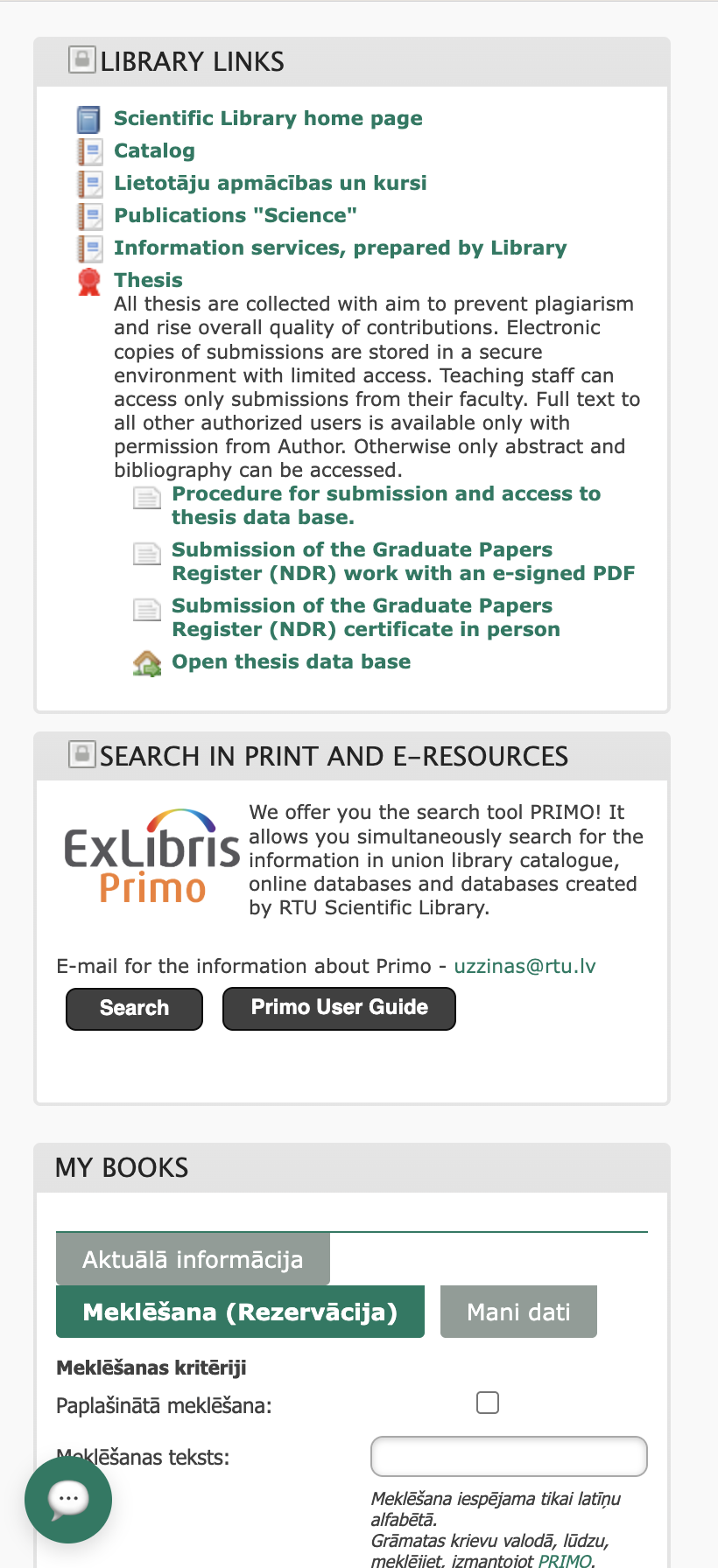
before | mobile
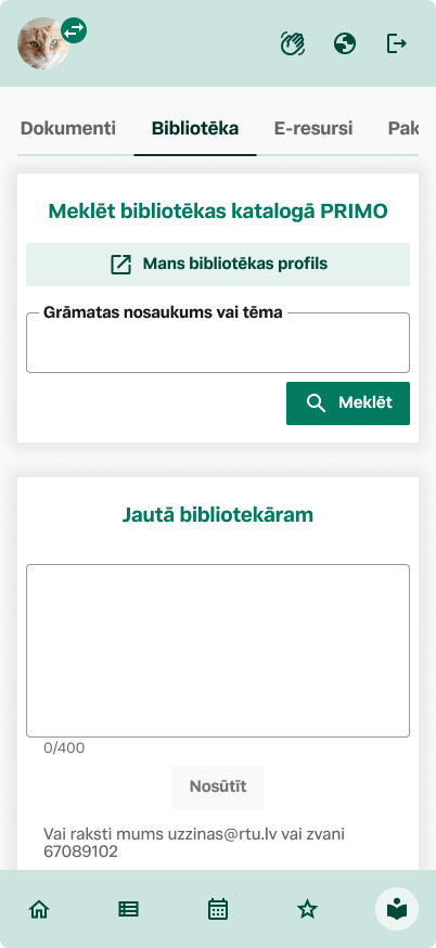
after | Library tab on mobile with most used function first hand
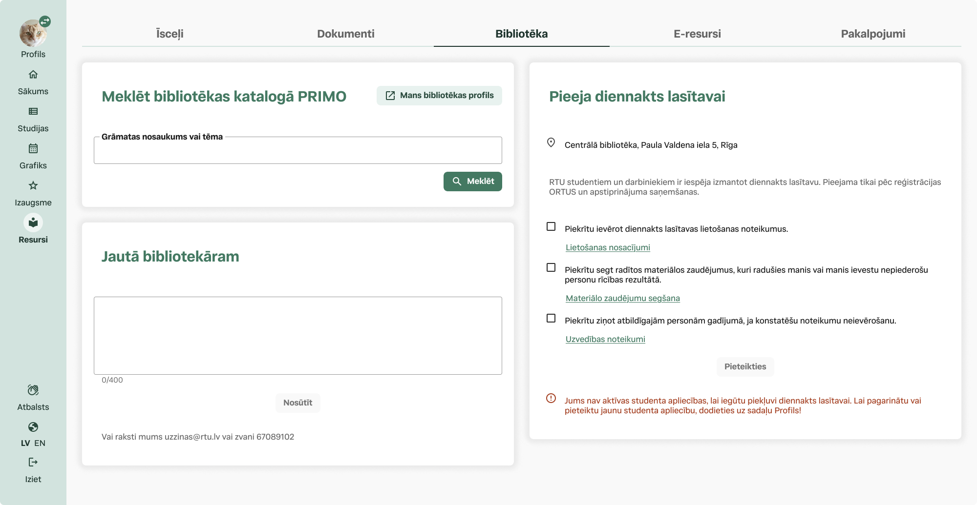
after | Library section, integrated search functionality, direct messaging, Reading room card sign up
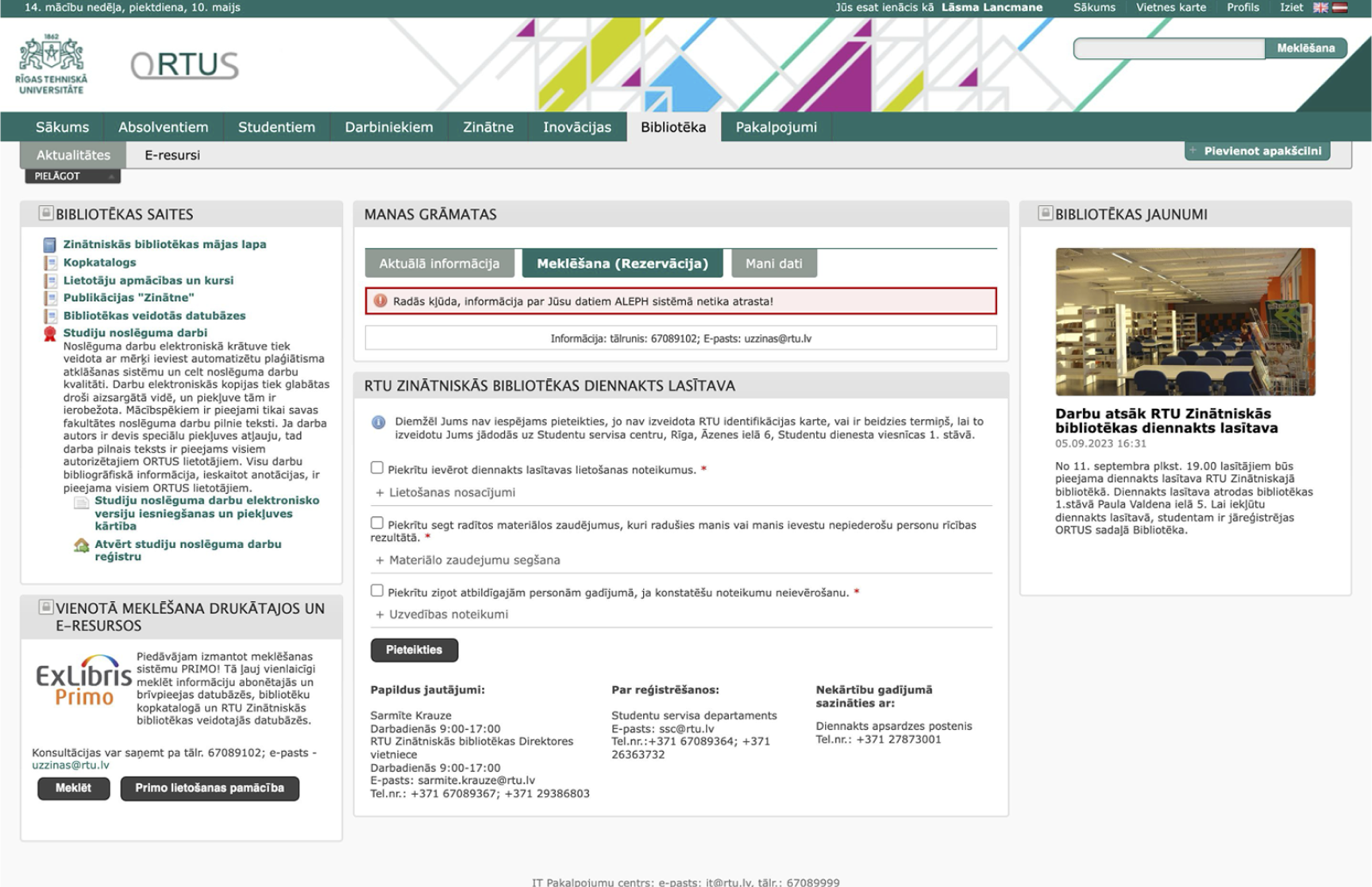
before | Library section, links, news, info about 24/7 Reading room
From a settings dump to an actual profile — consolidating fragmented settings into a single system of record.
The old page had no name, student ID, or program anywhere on it — just nine scattered widgets, half the space taken up by photo compliance rules. I rebuilt it around real profile data — study info, personal info, and a new profile switcher for students with more than one enrollment history, like someone returning to study years after their first degree. Password and contact changes are now handled inline, instead of pointing off to separate pages.
A quiet detail: the profile switcher with radio buttons isn't just for students juggling two roles at once — it also covers someone returning to RTU years after graduating, letting them move between their current studies and an older enrollment without needing two separate accounts.
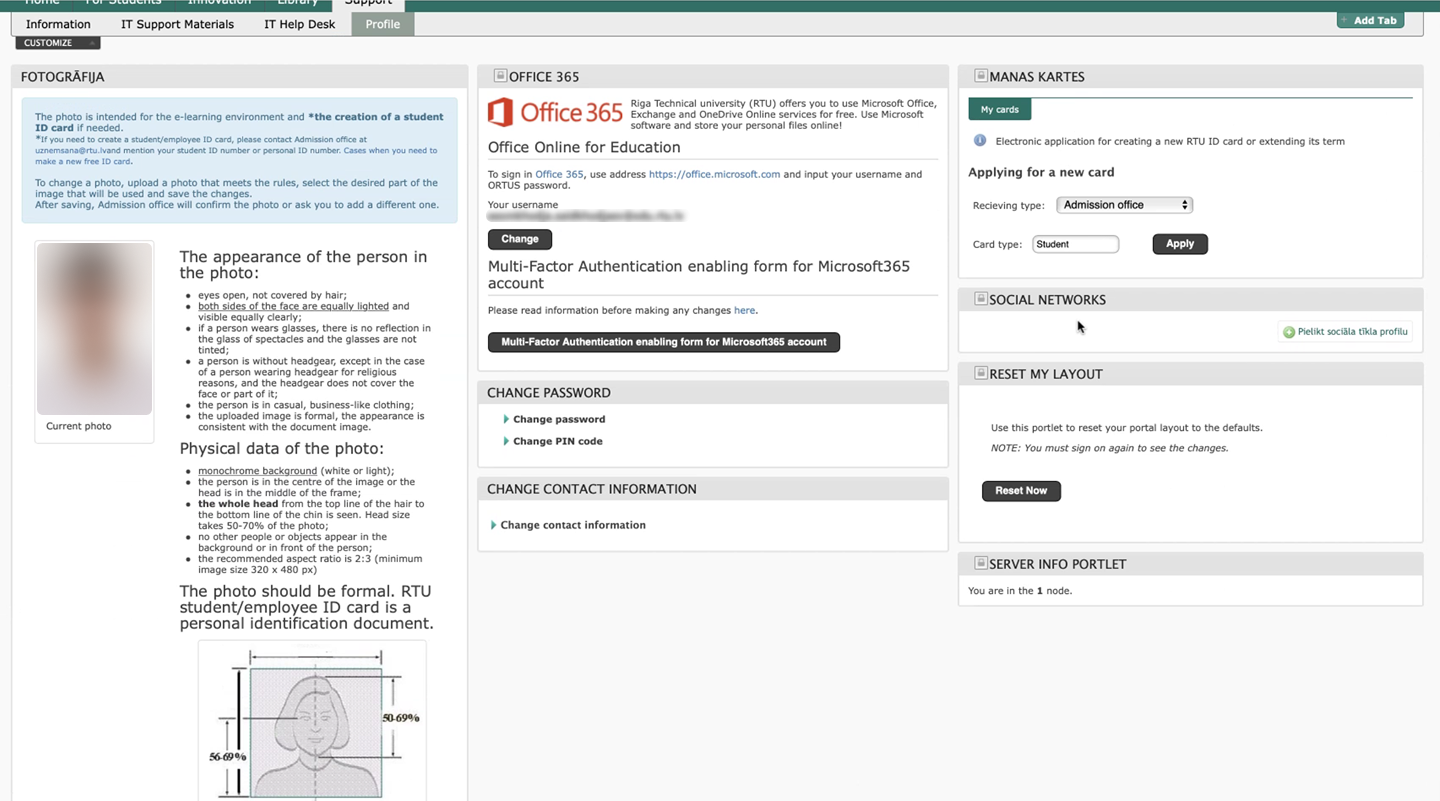
before | My profile
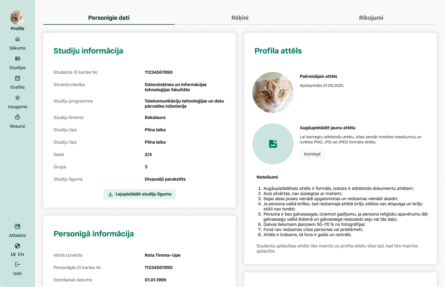
after | My profile
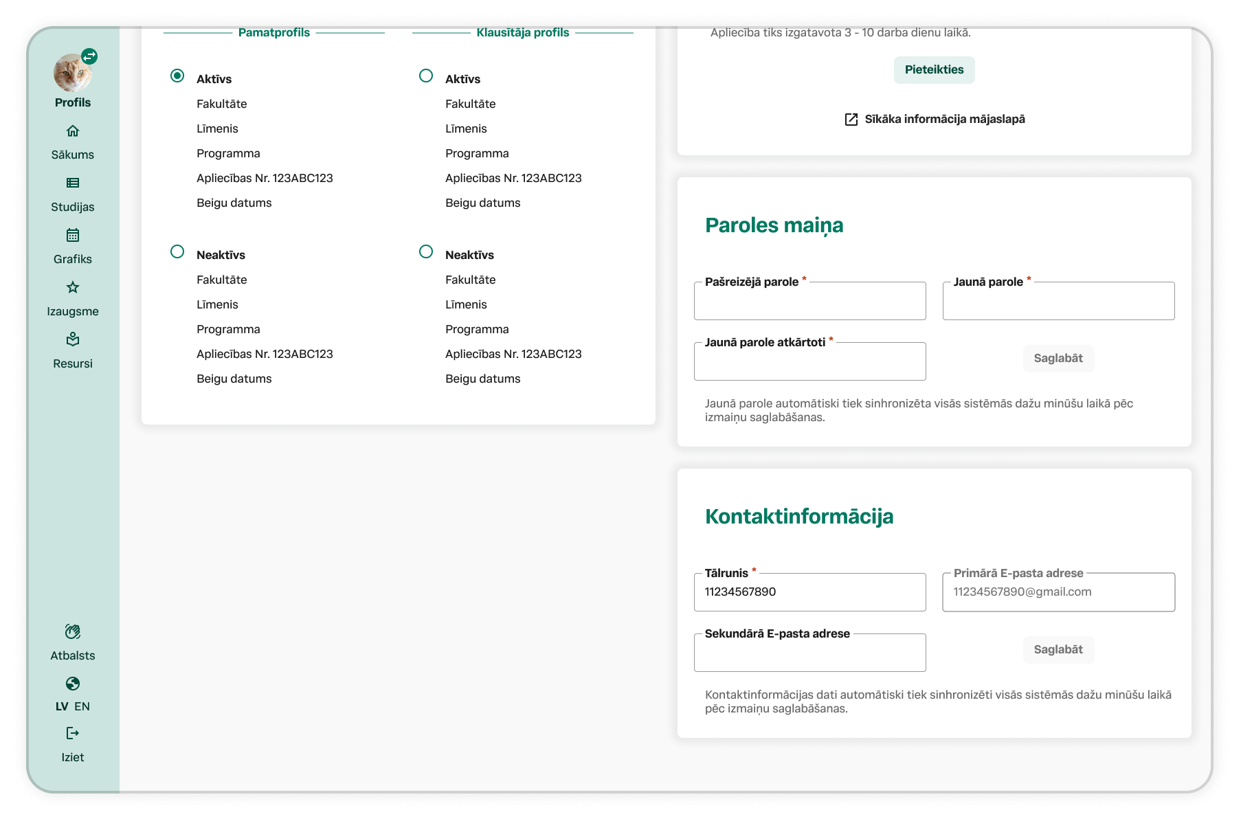
Screenshot of a user profile webpage with a teal sidebar menu on the left, including icons and text for navigating sections like 'Profils', 'Sākums', 'Studijas', 'Grafiks', 'Izaugsme', 'Resursi', and language options 'LV' and 'EN'. The main area displays a profile form in Latvian, with sections for profile status, application details, password change, and contact information. The form includes fields for email addresses, phone numbers, and password updates, along with buttons to save changes.
New ground, not just a new coat of paint.
Not every part of this redesign had something to replace. Scholarships and loans, mobility, career services, notifications, e-resources, and a proper library search were either missing entirely or scattered across disconnected pages with no dedicated home. Below is a wider look at what the new portal actually contains — built as new information architecture, not a reskin of what came before.
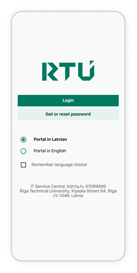
A mobile phone screen displaying a login page for RTU, an IT service portal, with options for Latvian or English languages and remember language checkbox, including contact information for Riga Technical University in Latvia.
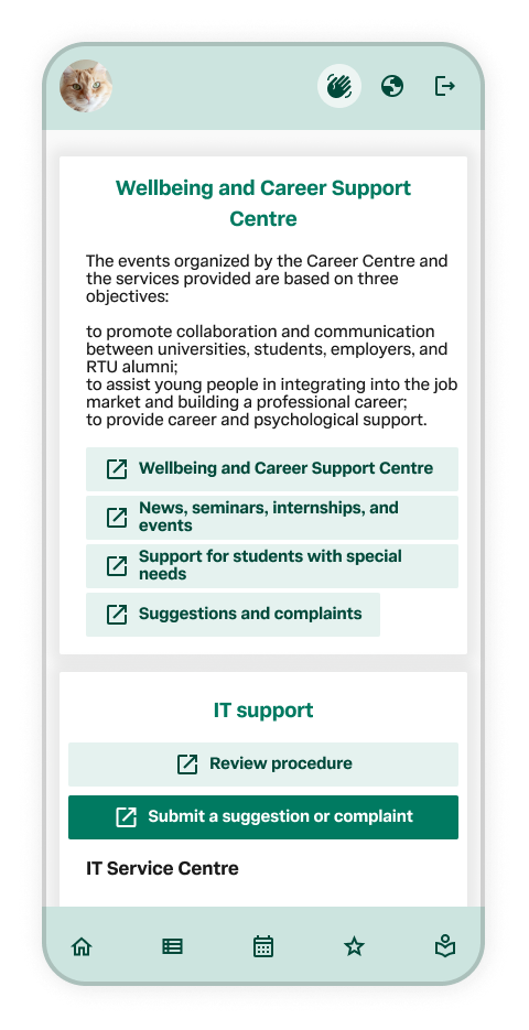
Mobile phone screen displaying a webpage for a Wellbeing and Career Support Centre, including sections for events, support for students with special needs, and submitting suggestions or complaints.
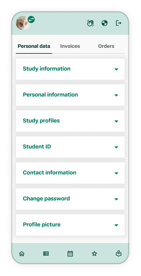
Screenshot of a mobile app settings menu showing tabs for Personal data, Invoices, and Orders. The menu includes options for Study information, Personal information, Study profiles, Student ID, Contact information, Change password, and Profile picture. The interface has icons at the bottom for home, list, calendar, star, and menu.
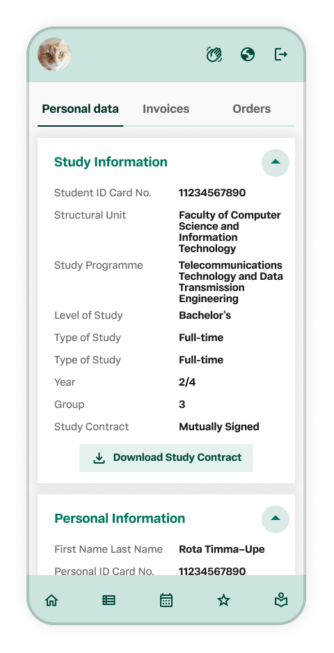
Mobile phone displaying a student portal with personal data, study information, and personal details, including study program, level, year, group, and study contract status.
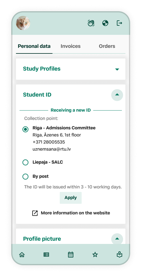
Screenshot of a mobile app with a section for personal data, showing a 'Student ID' step. The screen displays options for collecting a new ID from Riga, Latvia, or Liepaja, Latvia, or by post, with an 'Apply' button and additional website link. The top menu includes icons for refresh, globe, and share. The top left corner shows a cat profile picture.
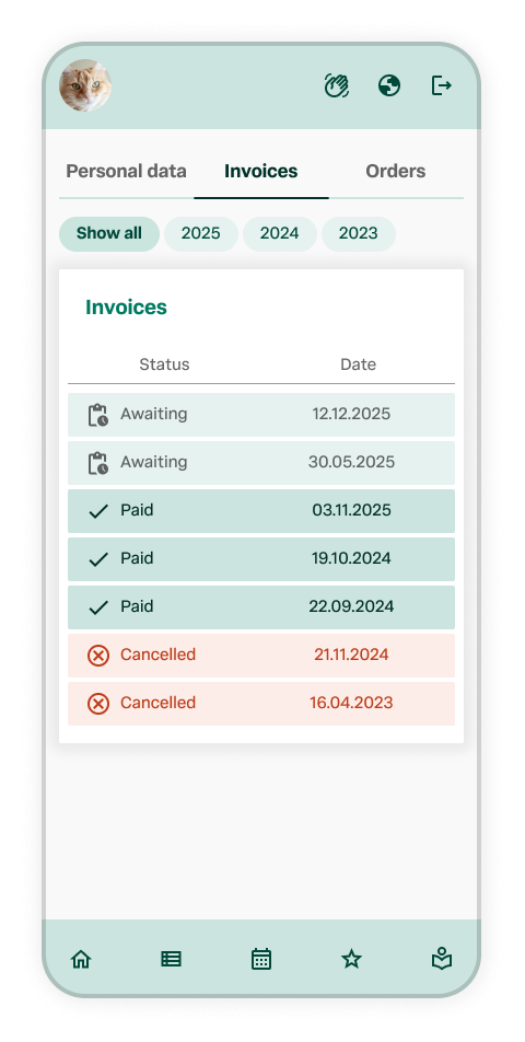
Mobile screen showing invoices with status and dates, including paid, awaiting, and canceled invoices, with tabs for different years.
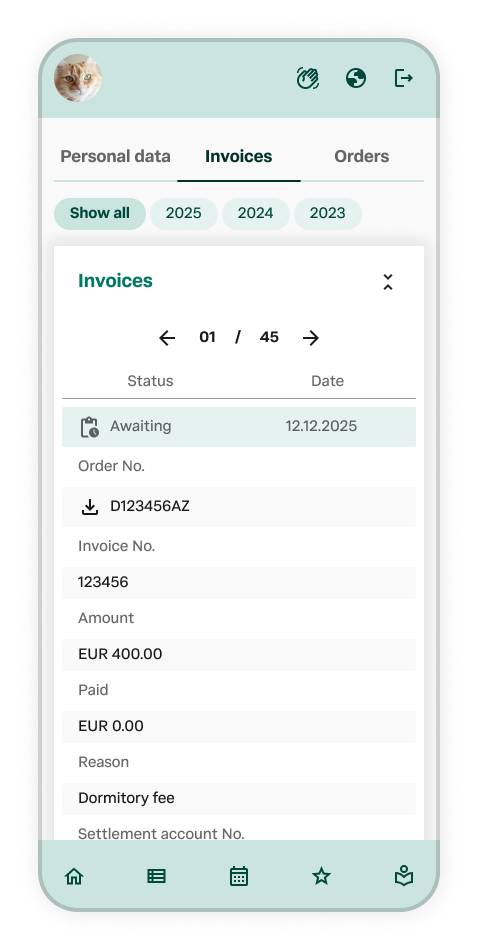
Mobile screen displaying an invoices section with invoice details, including status 'Awaiting', date '12.12.2025', order number, invoice number, amount EUR 400.00, paid EUR 0.00, reason 'Dormitory fee', and settlement account number.
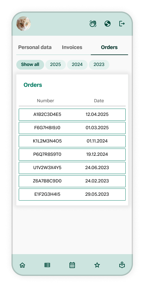
Screenshot of a mobile app displaying order IDs and dates, with tabs for Personal Data, Invoices, and Orders, and a profile picture of a cat in the top left corner.
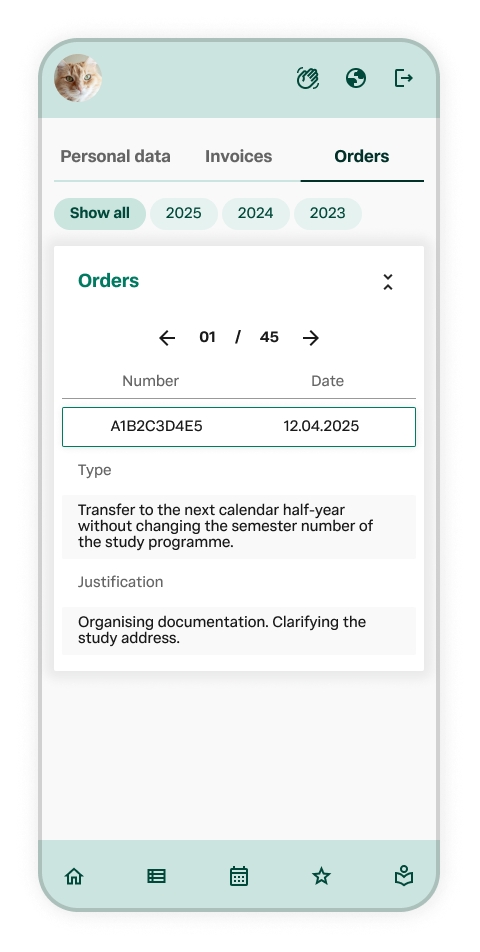
Mobile app screen showing an order with order number A1B2C3D4E5 dated 12.04.2025, containing a note about transferring to the next calendar half-year and clarifying the study address, with navigation tabs for personal data, invoices, and orders, and icons at the bottom for home, menu, calendar, favorites, and profile.
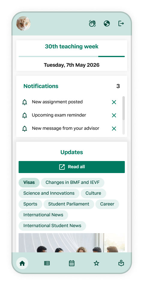
Mobile app screen displaying notifications and updates related to a university or educational institution, with a header indicating '30th teaching week' and the date Tuesday, 7th May 2026.
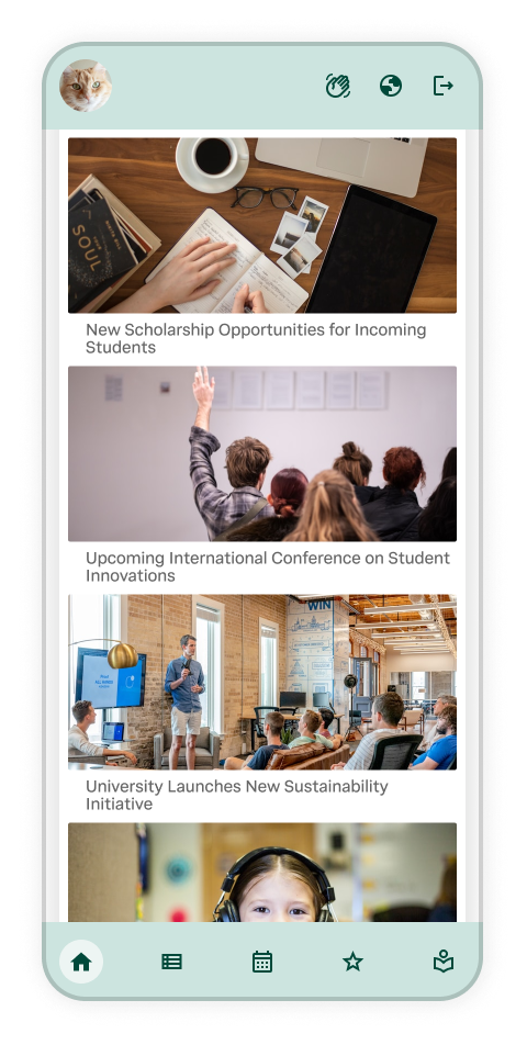
Smartphone screen displaying a news app with articles about scholarships, a conference, a university initiative, and a girl wearing headphones.
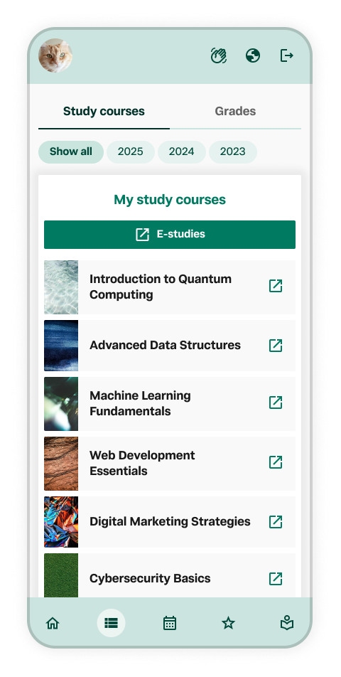
Screenshot of a mobile e-learning app showing a list of study courses.
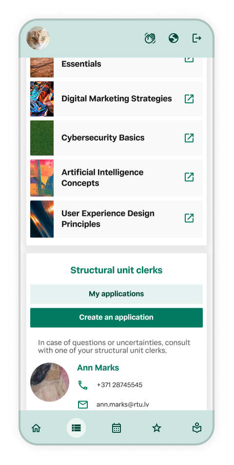
Smartphone displaying a contact profile, an application menu with course categories, and navigation icons at the bottom.
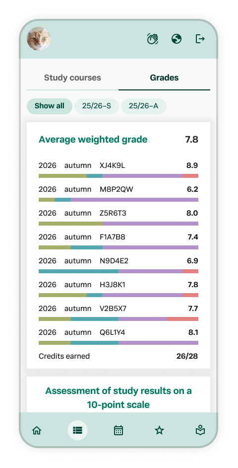
Mobile phone screen showing a grading app with course grades for autumn 2026, including average weighted grades and specific course scores, with navigation icons at the bottom.
Mobile app screen displaying student grades and course progress, including an average weighted grade of 7.8, course completion status, and details for courses.
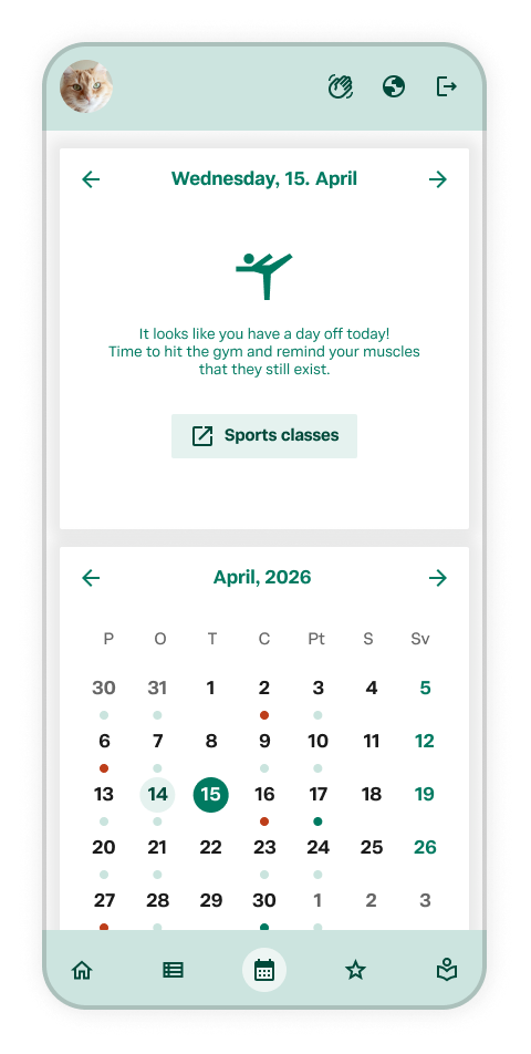
Mobile app screen showing the date April 15, 2026, with a calendar and sports classes notification for April 15.
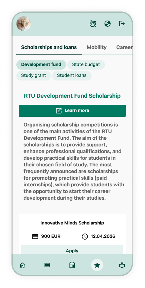
Mobile phone screen showing information about the RTU Development Fund Scholarship, including details on organizing scholarship competitions, application fee of 900 EUR, deadline on 12.04.2026, and a 'Learn more' button.
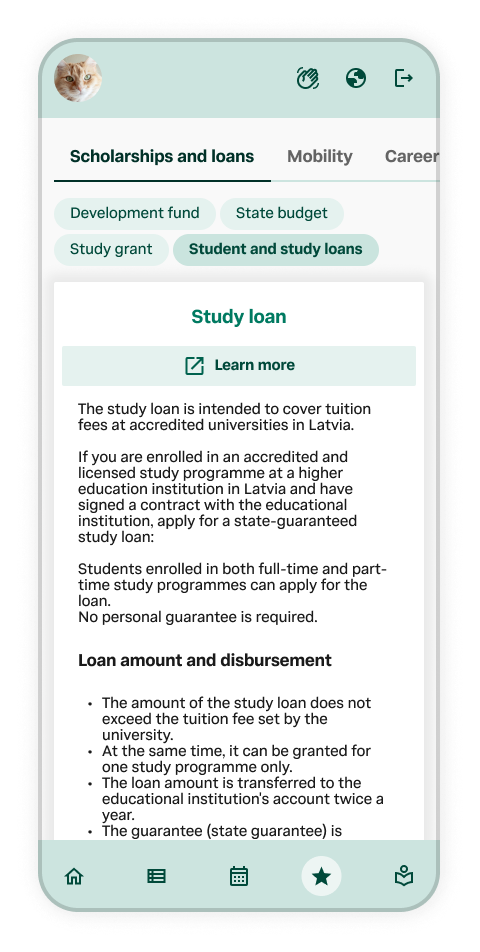
Mobile app screen showing information about student and study loans, including categories like scholarships, development fund, state budget, and study grants with detailed descriptions.
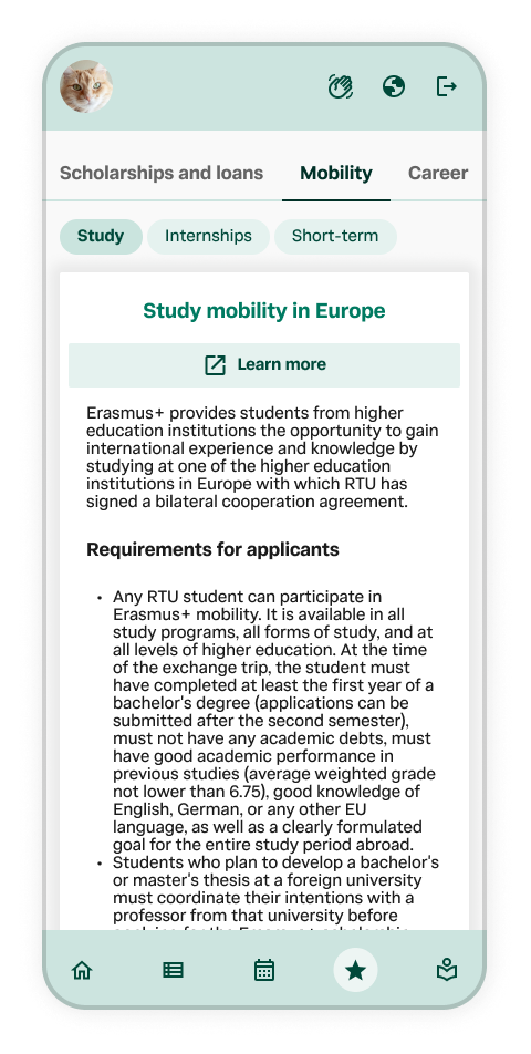
Screenshot of a mobile app page about studying abroad in Europe through Erasmus+program, with navigation tabs for scholarships, loans, mobility, and career. The page details requirements for student applicants.
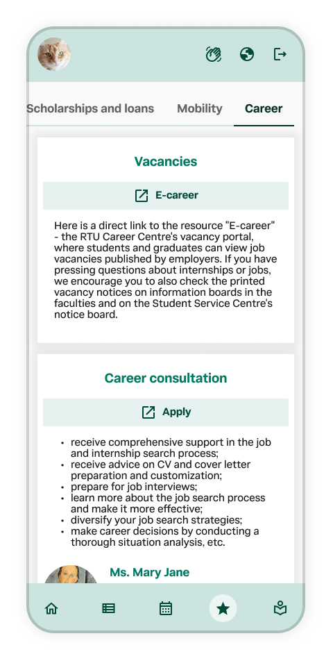
Screenshot of a mobile app displaying career resources on a university website, including sections for vacancies, career consultation, and a contact person.
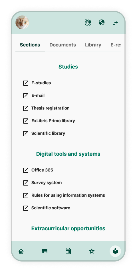
Mobile phone screen displaying a university or academic app with sections for Studies, Digital tools and systems, and Extracurricular opportunities, including options such as E-studies, E-mail, Thesis registration, Office 365, Survey system, and Science software.
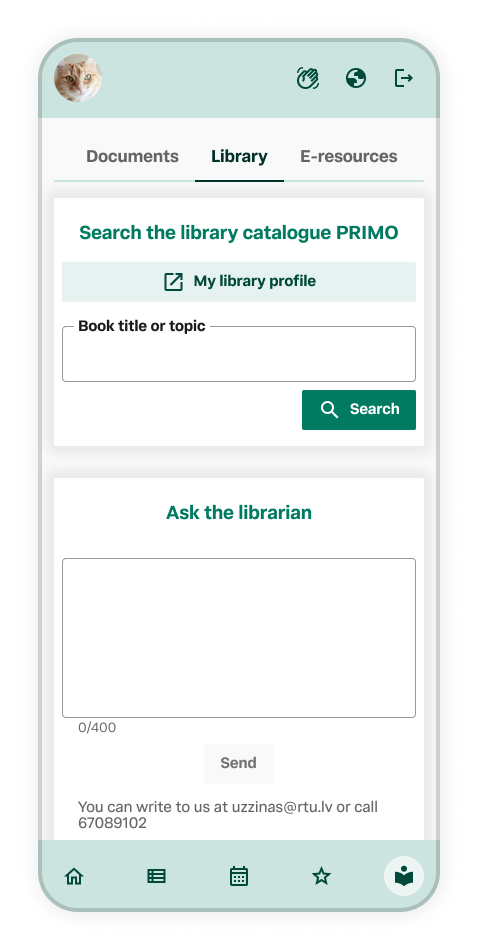
Mobile app screen showing library search and ask a librarian features with tabs for Documents, Library, and E-resources at the top. The Library tab is active, displaying options to search the library catalog or ask a librarian.
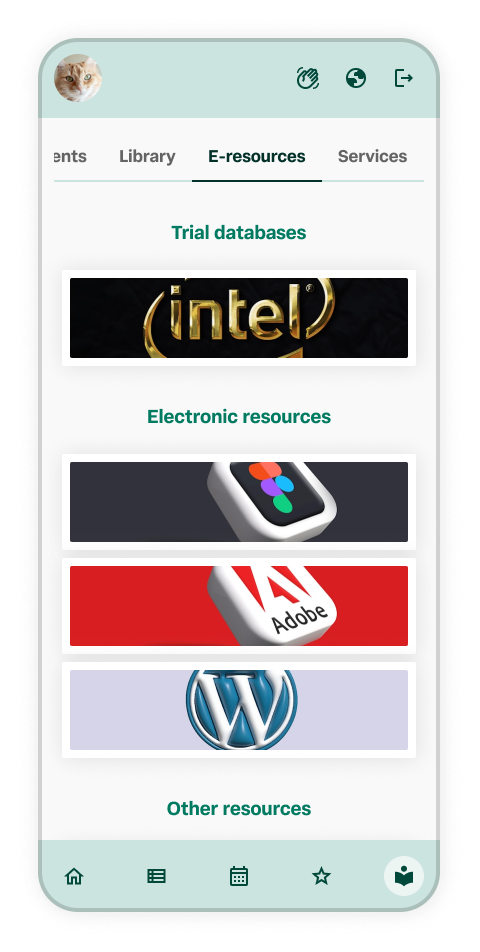
A mobile app screen displaying various e-resources including trial databases, electronic resources.
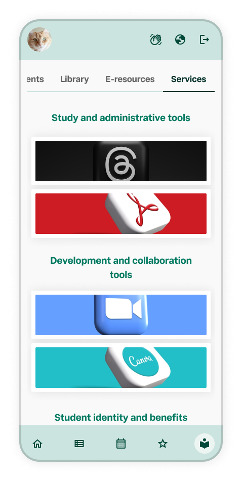
Smartphone screen displaying a user interface with tabs labeled 'Apps,' 'Library,' 'E-resources,' and 'Services.' The 'Services' tab is active, showing sections titled 'Study and administrative tools,' 'Development and collaboration tools,' and 'Student identity and benefits,' with icons for each section.
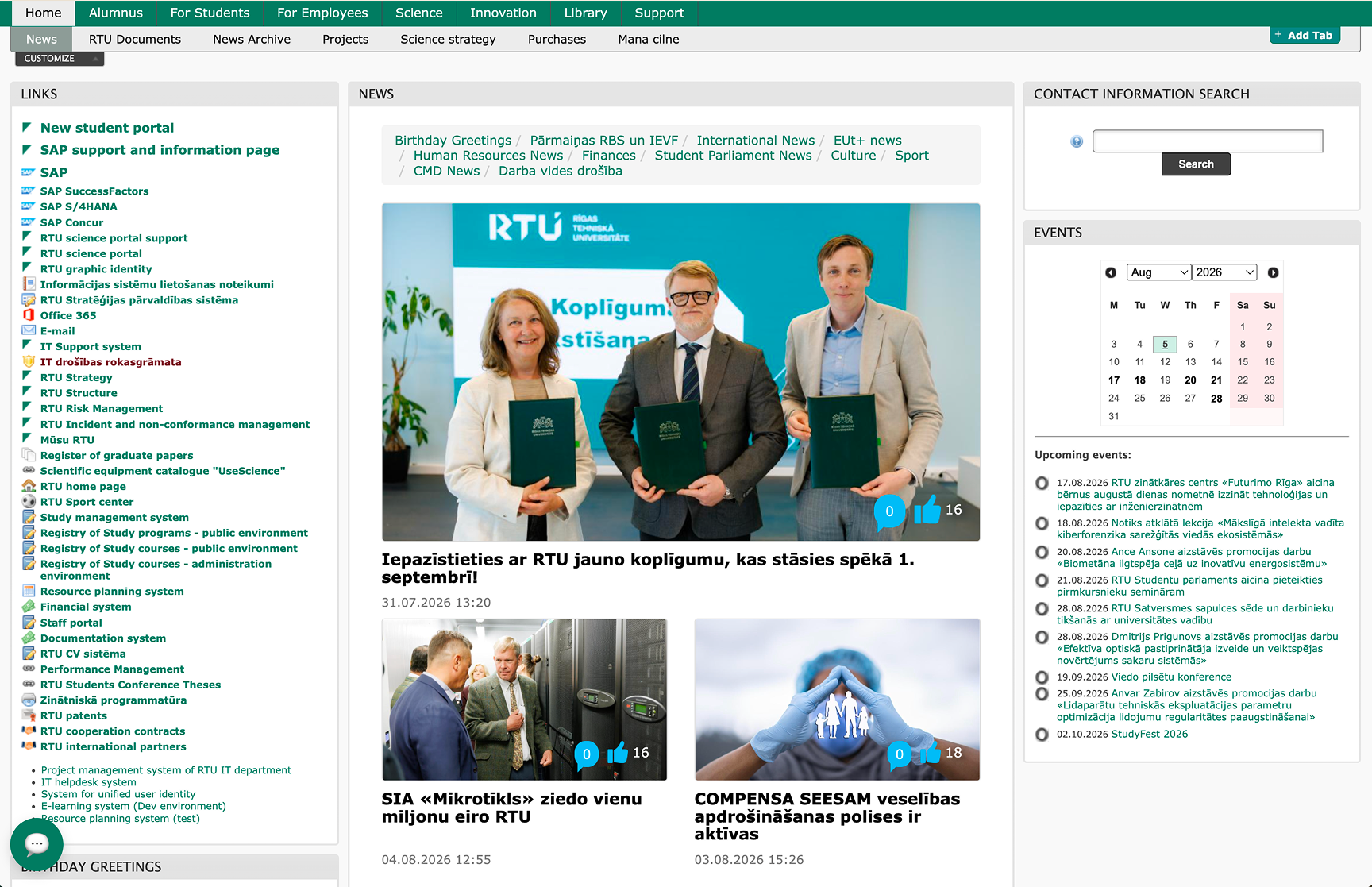
RTU university webpage showing news articles, calendar, contact search, and links menu with a central photo of three people holding documents, standing in front of a RTU banner during a signing event.
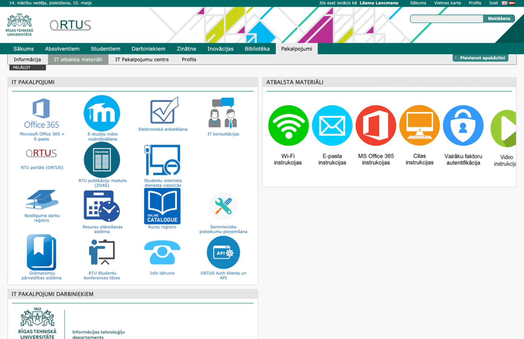
Screenshot of a university online portal homepage with icons and menu options for IT services, resources, and materials, including sections for Office 365, electronic surveys, IT consultations, and Wi-Fi instructions.
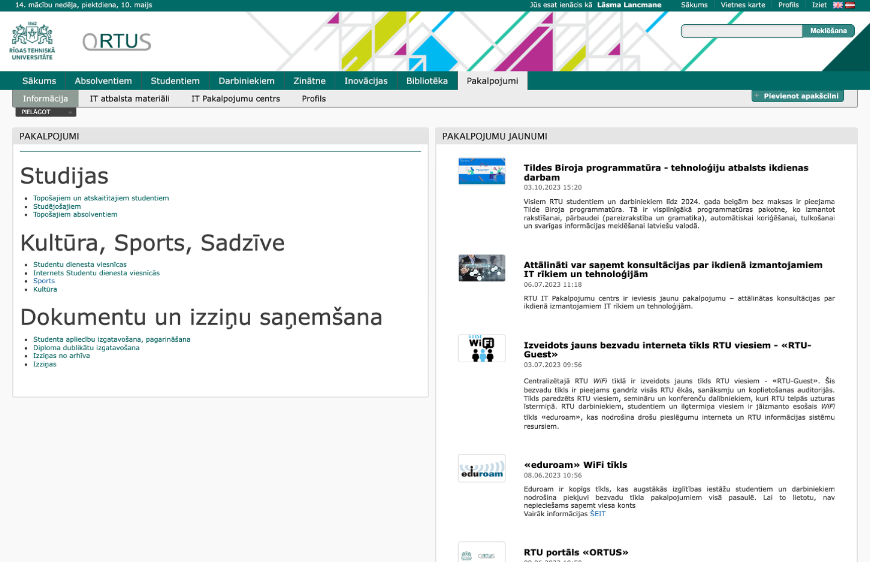
Screenshot of RTU Riga Technical University webpage showing various study programs, student resources, and news updates related to IT services, WiFi, and digital resources.
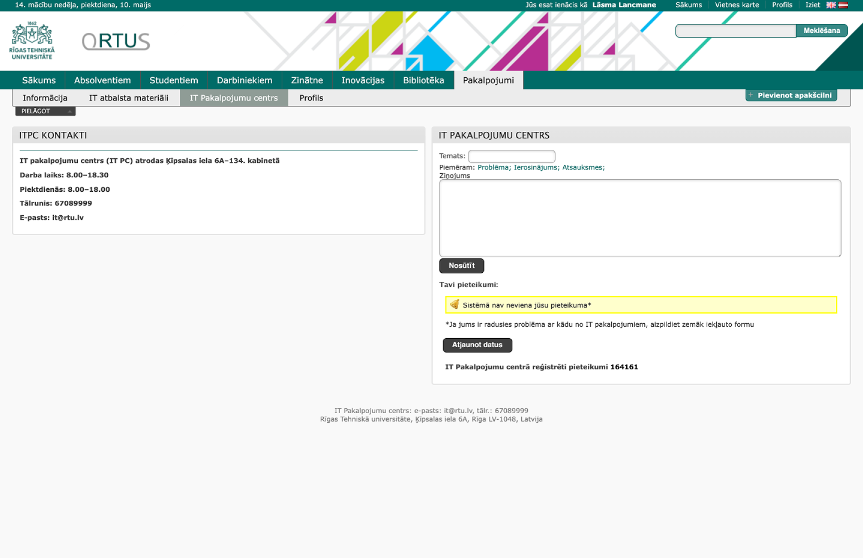
Screenshot of Riga Technical University library webpage showing contact information, library hours, and a message indicating no applications were received, with navigation tabs at the top and a search bar.
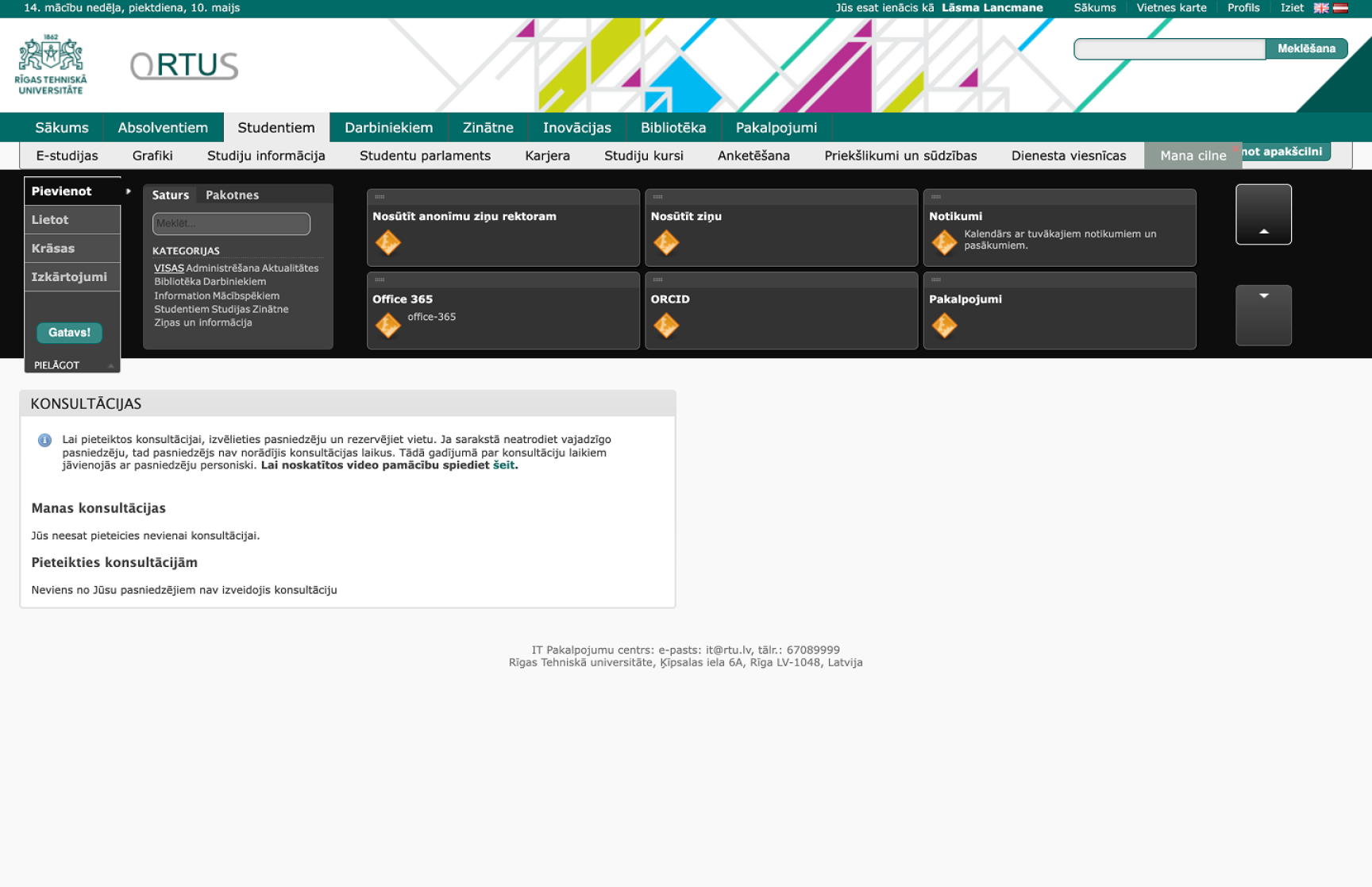
Screenshot of the Riga Technical University online portal displaying options for student consultations, including categories and instructions in Latvian.
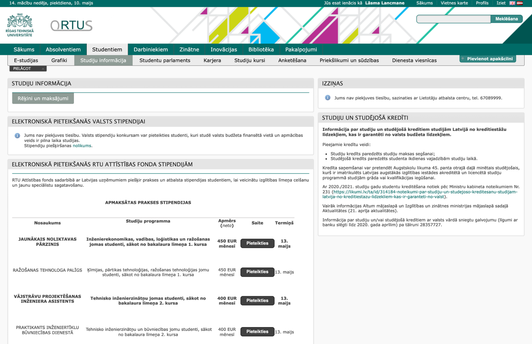
Screenshot of Riga Technical University (RTU) online platform displaying study program information, application details, and scholarship options.
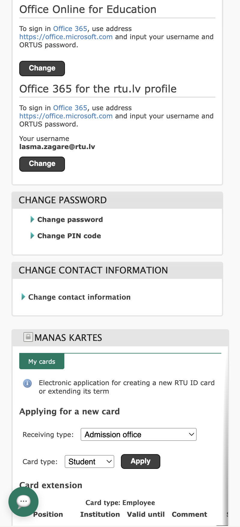
Screenshot of an online Office 365 account management page with sections for changing password, contact information, and applying for a new RTU ID card.
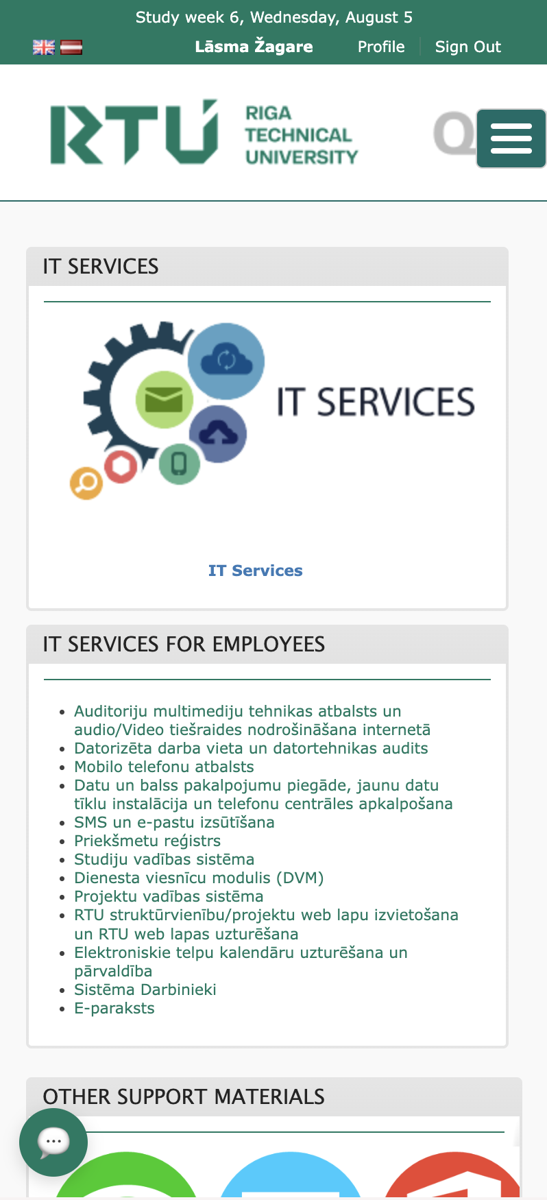
Screenshot of Riga Technical University website page for IT services, showing a header with study week information and the university logo, an icon-based graphic for IT services, and text describing various IT support services for employees.
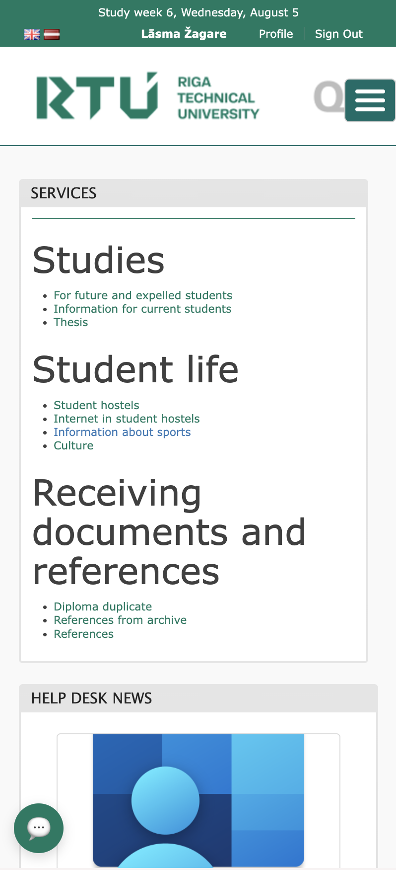
Screenshot of Riga Technical University webpage for studies, student life, and document retrieval services, with the university logo at the top and a help desk section below.
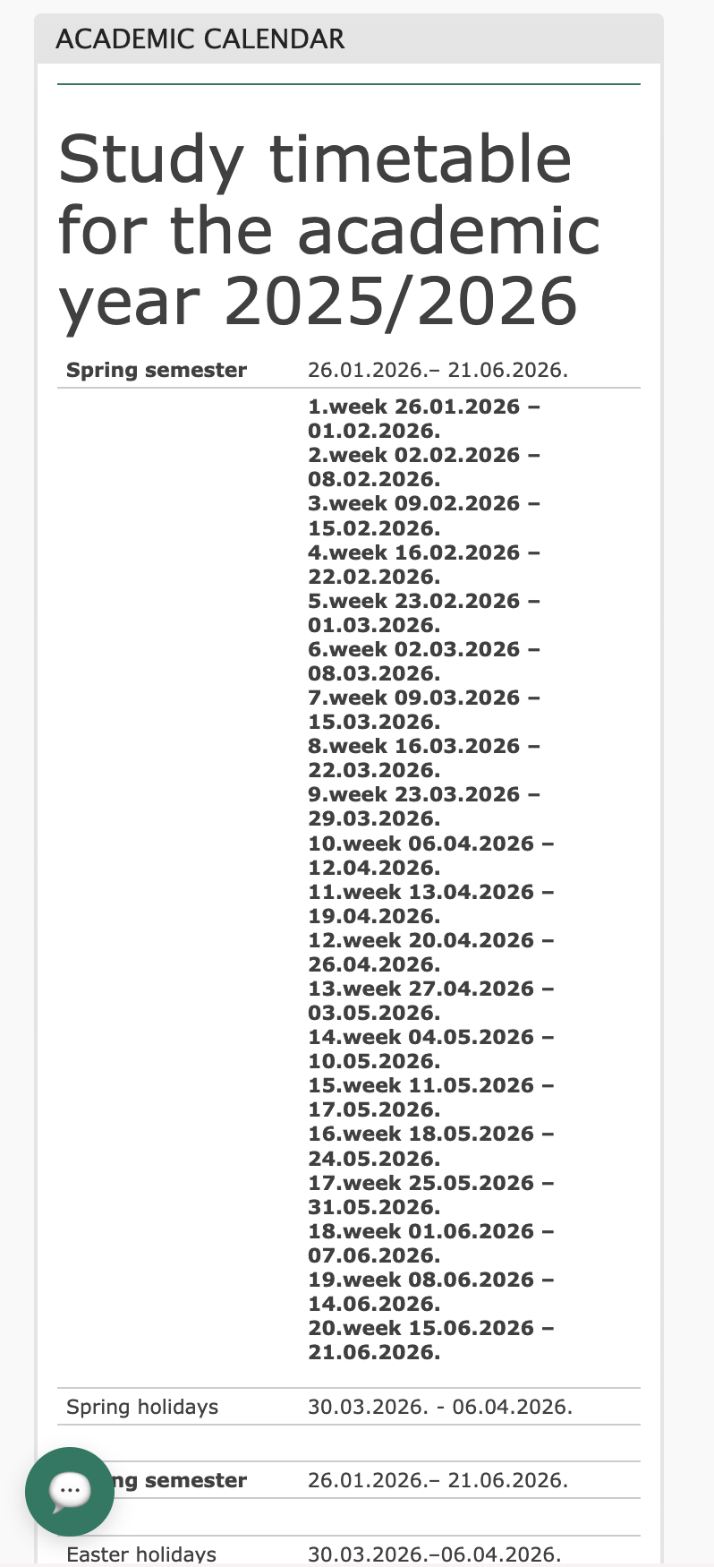
Academic calendar for the 2025/2026 school year, showing weekly dates for spring semester from January 26, 2026, to June 21, 2026, including holidays in late March and early April.
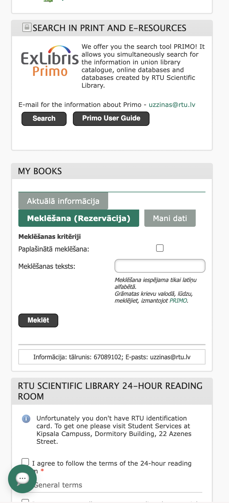
Screenshot of a library website interface, showing search tools, books, and RTU scientific library information.
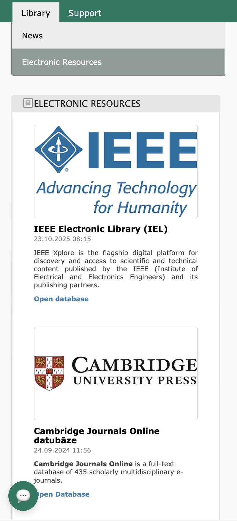
Screenshot of a digital library interface showing sections for electronic resources, including IEEE Xplore and Cambridge Journals Online.
This is the fuller picture: dozens of pages, one consistent system — built once so it wouldn't need rebuilding for every new department that shows up.