ROLE
UX/UI designer
TOOLS
Figma & FigJam, Hotter, Microsoft Clarity, Atlassian (Confluence & Jira)
TEAM
PM + 2 developers
TIMELINE
2024 – 2027
STATUS
Launching in spring 2027
IMPACT SO FAR
→ Buy-in from 500+ pages of daily content maintainers
→ 21 universities benchmarked
→ Designed to WCAG 2.2 AA accessibility standards throughout – not yet audited, as the site is still in build
Website for #1 university in Latvia
UX/UI for Riga Technical university's digital front door.
500+ pages serving prospective and current students, staff, research and business partners.
Out with the old.
In with the new.
This project began with a clear requirement: modernize and simplify the website so it reflects the university's prestige while making it easier for users to navigate.
Despite being ranked #1 in Latvia by QS, RTU's digital products were, until 2024, designed by backend engineers rather than trained designers. I was brought in to change that — introducing a full UX/UI approach across all internal and external digital platforms.
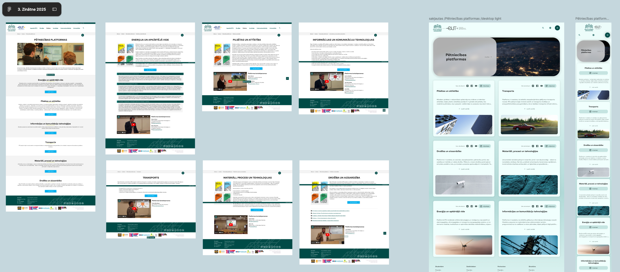
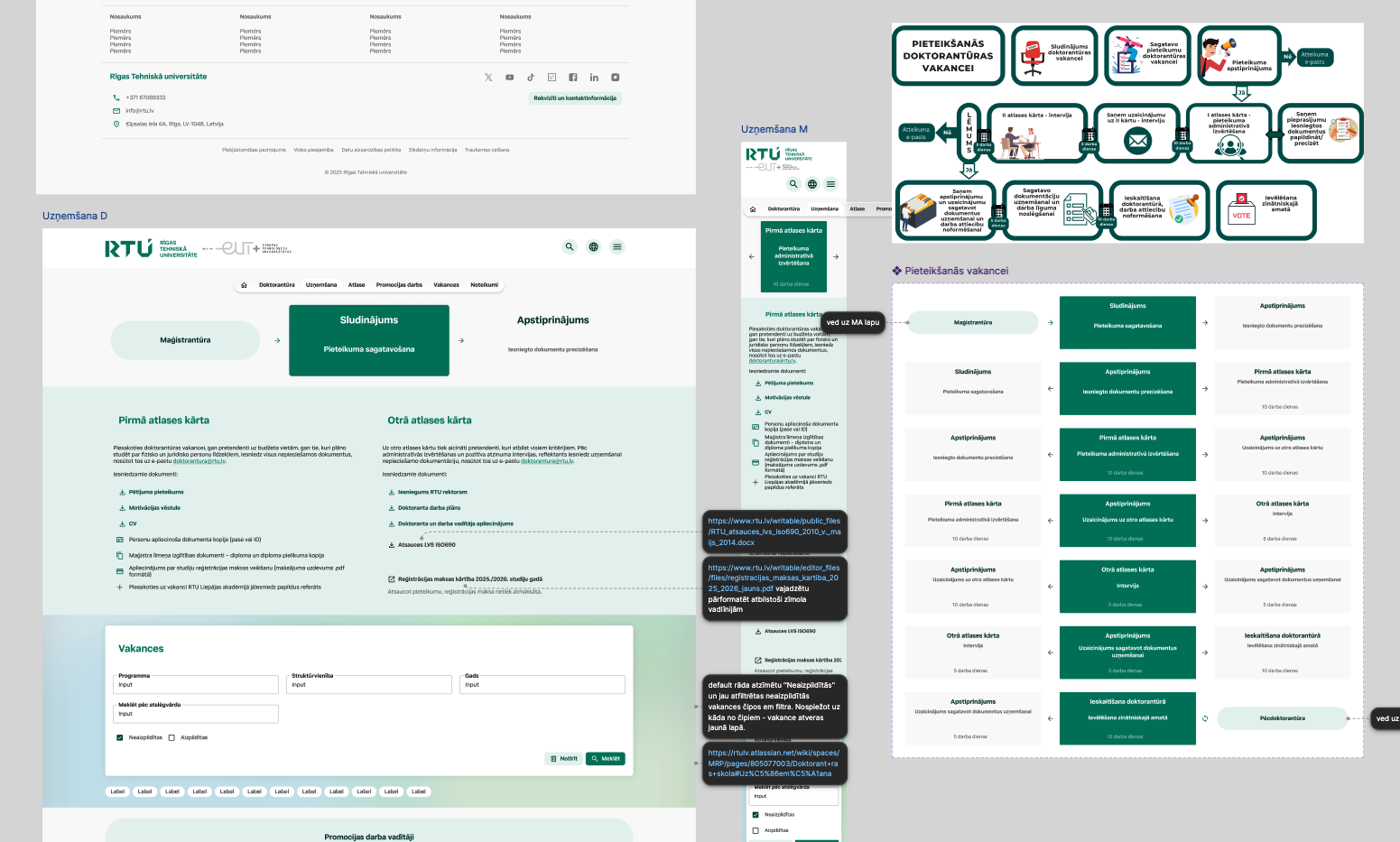
Exploratory research
With a project spanning 500+ pages, research took up the largest portion of our timeline. As the sole designer on a small team — alongside a project manager and one developer — I was responsible for gathering all the data myself.

At the outset, we only had Google Analytics to work with, so I quickly brought in Hotjar to start collecting heatmaps, scrollmaps, and session recordings for the following month at minimum. I also ran Microsoft Clarity for a quick diagnostic scan and pulled PageSpeed numbers to hand off to our developers — there was clearly a lot of optimization ahead.

But quantitative data alone wouldn't be enough. With four distinct audiences using the website, user interviews were essential. These conversations later shaped four separate user personas and their corresponding journey maps.

My hands were full, but I knew that building a genuinely modern site meant a competitive audit couldn't be skipped — it would give us the missing piece of the puzzle. I audited world-leading and neighboring universities, ranking 21 of them feature by feature to identify what we could build to stand out, and which problem zones to watch for. This process turned out to be far more educational than I expected, giving me a rich set of good and bad examples to base my decisions on throughout the rest of the project.-
Excellent organization across the site
Outstanding map, virtual tour, and audio guide, making campus exploration intuitive and accessible
Well-structured academic calendar and course descriptions
Authentic photography — real people, real emotions, rather than generic stock imagery
Clear, direct text and guidance throughout
Easy access to student-relevant opportunities, such as job shadowing and summer schools
Well-organized contact directory
Easily navigable website that projects a modern, contemporary university image
Informative videos and descriptions for study programs
Strong overall structure
Distinct visual identity per major section — each key area has its own dedicated page with its own color palette and stylistic "personality"
Open Brand Resources section, accessible to both students and staff for creating presentations and other materials that represent the university
-
Information Overload — the user journey needs to be reviewed and simplified; too much information is presented without clear prioritization.
Lack of Focus — when everything competes for attention, nothing actually captures it. The page tries to say too much at once, and as a result, nothing stands out.
Weak Calls-to-Action — CTAs need to be more visible, more colorful, and more inviting to drive engagement.
Missing Engagement Pathways — the website doesn't proactively offer engagement opportunities for its different audiences unless they're actively searching for them. Each audience needs a clear CTA to prompt action — whether that's learning about campus life, exploring academic programs, learning about the rector, or scheduling a visit.
Underused Illustration & Visuals — the site needs more illustration, more creativity, and more visually inviting content to guide and engage users. Image carousels connected with illustration should be used throughout the page to make it visually compelling without overwhelming visitors. Images should be fewer in number, but more intentionally chosen.
Disconnected Storytelling — each section reads as a standalone piece rather than guiding the user naturally from one content area to the next.
Unclear Navigation — the site needs a well-organized, clearly structured navigation system.
No Audience Segmentation — there's no clear division of content tailored to different audience types.
Missed Opportunity to Showcase Pride Points — given that the university takes pride in its achievements, it would make sense for student work and institutional milestones to be visible on the homepage without users having to search for them. This would add a sense of personality, invite users to feel part of the community, and spark prospective students' interest in program quality.
Untapped Potential — disengaging design leads to lost users, which ultimately means lost prospective students.
-
User Flow;
Strong Branding & Design System;
Responsive Design;
Storytelling;
Structure & Navigation.
Stakeholder Interviews
Interviews were just the beginning of many rounds of collaboration with stakeholders. The website spanned six offices and 3+ departments and institutes nested under each one. As a bureaucratic institution, everyone had an opinion on their section and pages of the site — so I sat down individually with each department to identify their business goals and align on a shared vision.

Rather than trying to gather everything in a single discovery phase, I ran these interviews iteratively – in parallel with design sprints. Stakeholder input continued alongside the design work, feeding into the prototypes as they developed.

I also presented the project to other departments across the university, since we wanted the launch to be transparent — keeping the whole institution informed and involved. Over time, people began reaching out to me directly, and I became the go-to person for anything related to the university website's content and future visual direction.
Workshops
To establish the "why" and the "what," I brought the research data into practice through collaborative workshops. Working with the team, we translated raw findings into tangible user personas, and four distinct characters were born:
User No. 1 — Prospective 1st-cycle student (i.e., prospective bachelor's-level student)
User No. 2 — Current student / Prospective 2nd-cycle student (i.e., prospective master's-level student)
User No. 3 — Startup: B2B partner
User No. 4 — Prospective 3rd-cycle student / Research collaboration partner (i.e., prospective doctoral/PhD-level student)
For each persona, we mapped out a full user journey — from first point of contact to their key goals and moments of friction. This exercise was pivotal: it revealed how to prioritize and structure the site's navigation, and later shaped the hierarchy of content across the entire website.
To keep the workshops collaborative and ensure every voice on the team was heard, we relied heavily on affinity diagramming — grouping ideas, pain points, and observations into clusters that helped us spot patterns none of us would have caught alone. We ran these sessions in FigJam, which made our meetings feel more dynamic and structured, rather than another static meeting on a calendar.
As the project moved from ideation into execution, we needed a system that stakeholders across departments could easily follow. We moved our Information Architecture documentation into Confluence for transparency and easy reference, and began organizing our work into Sprints in Jira – giving the project a clear rhythm and making progress visible to everyone involved, not just the core design team.






Discover & Define
Starting from zero. Twice
Once we'd completed our research, analysis, and planning, we started laying out ideas into wireframes and moving into ideation. But it wasn't that simple. This project has a far more unique story than a typical one.
At the time, the only brand reference we had was a 10+ year old presentation, mostly covering graphic design guidelines for posters and print materials. A design system had never been a priority for the university — until then, backend engineers had been building the UI themselves, as best they could, far removed from design thinking, responsive layouts, or accessibility.
Since I was already working across multiple projects at the university, I had started building a design system in parallel. So this project launched with fresh components straight out of the Figma oven. (More on the design system project later.)
Little did we know that a full rebrand was coming just a year later. Everything I had prototyped up to that point had to be rebuilt from scratch, and I quickly assembled a new design system based on the new branding. As a result, that first version never actually saw daylight — it lived only in the testing space.
Develop & Deliver
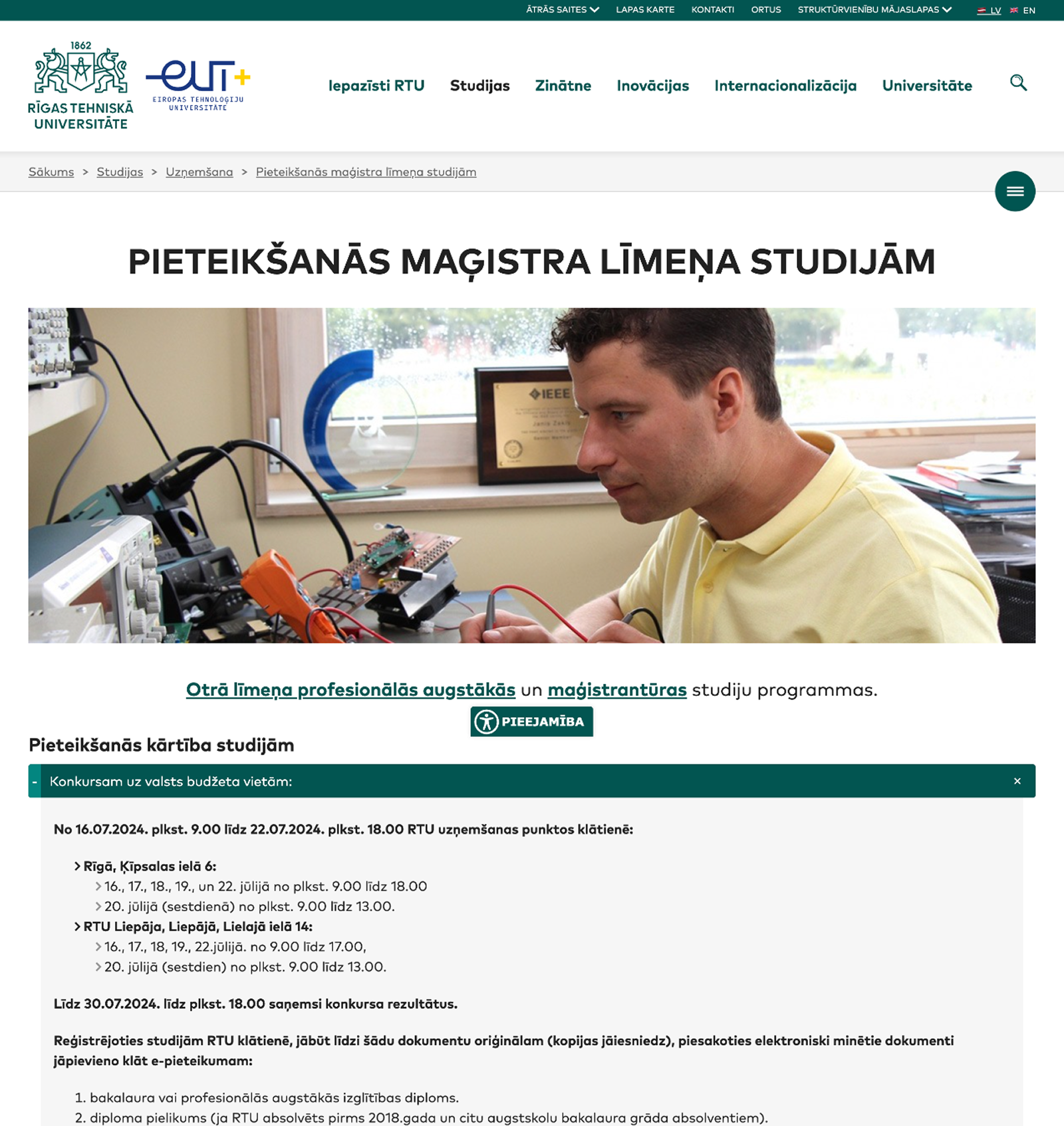
Up to 2026 the website still looked like it had been frozen in 1999.
Dense, monolithic blocks of text, awkwardly tucked into accordion menus, with an avalanche of subpages you could hardly keep track of and navigation so tangled even employees routinely lost their way. Not even starting on driving inquiries to the admissions office.
First attempts to bring the wireframes to life happened in 2024.
I realized that for users to navigate conveniently we needed smart, fast search options and for all the content to be split in half — rewritten cleanly and made easy to understand.
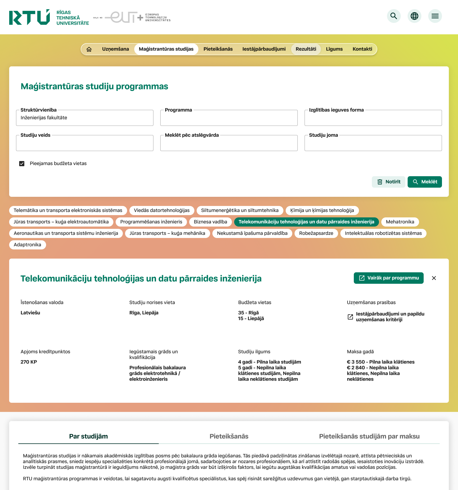
In the end of 2025, the new branding dropped.
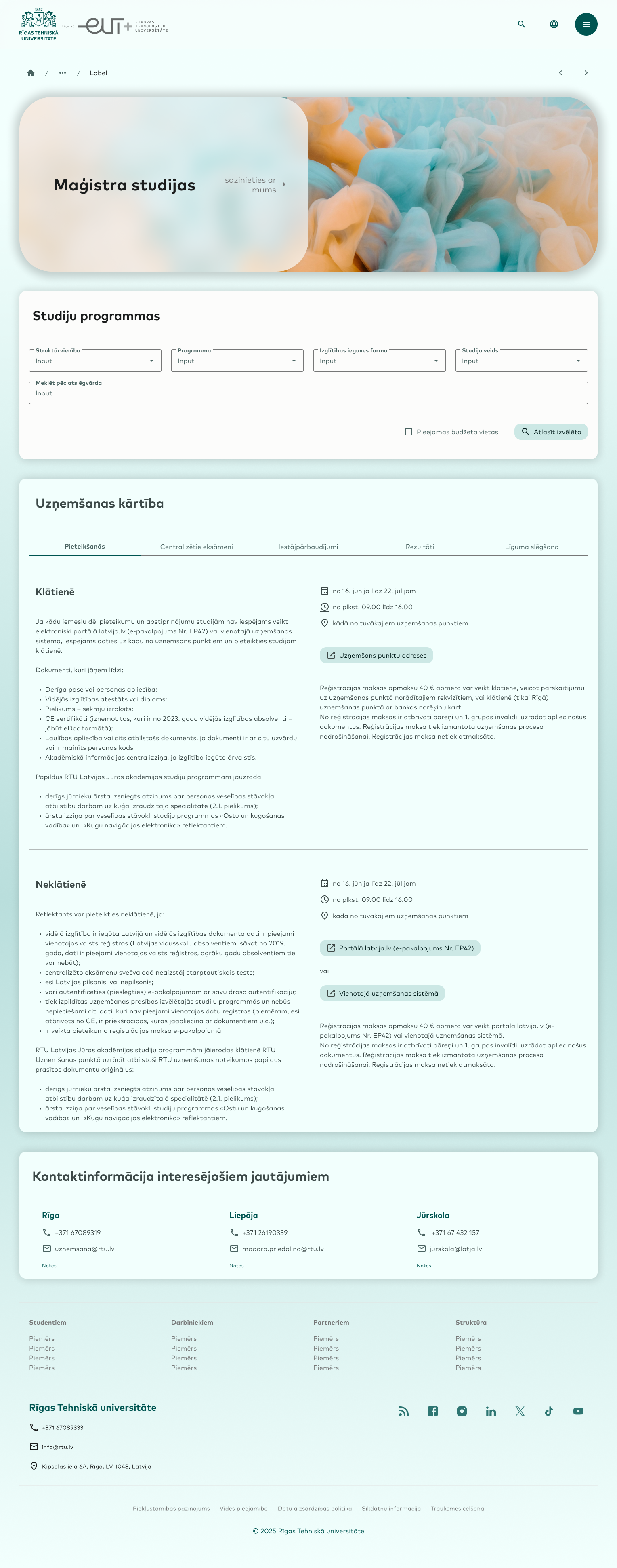
I overhauled the design system, smoothed out the curves, refreshed the color palette, and kept the clean aesthetic — while developing an even better approach for users to navigate the 1K+ study program universe. Mobile friendly and intuitive, it puts the information you need at your fingertips, wherever you are.
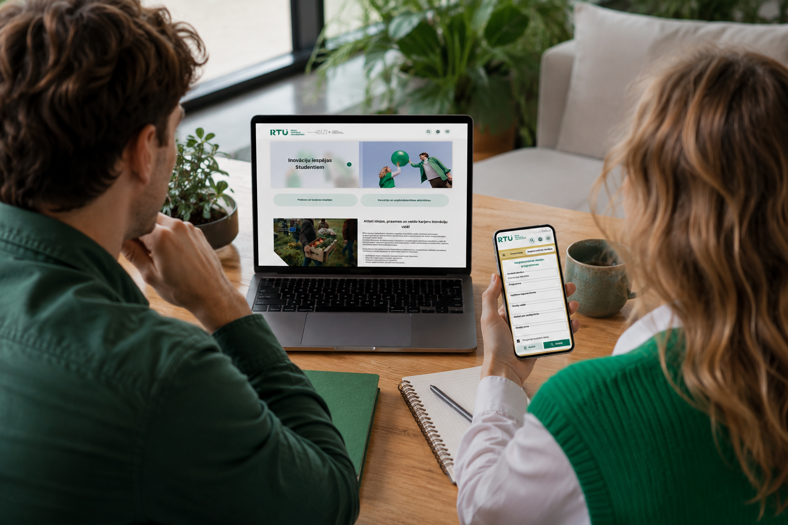
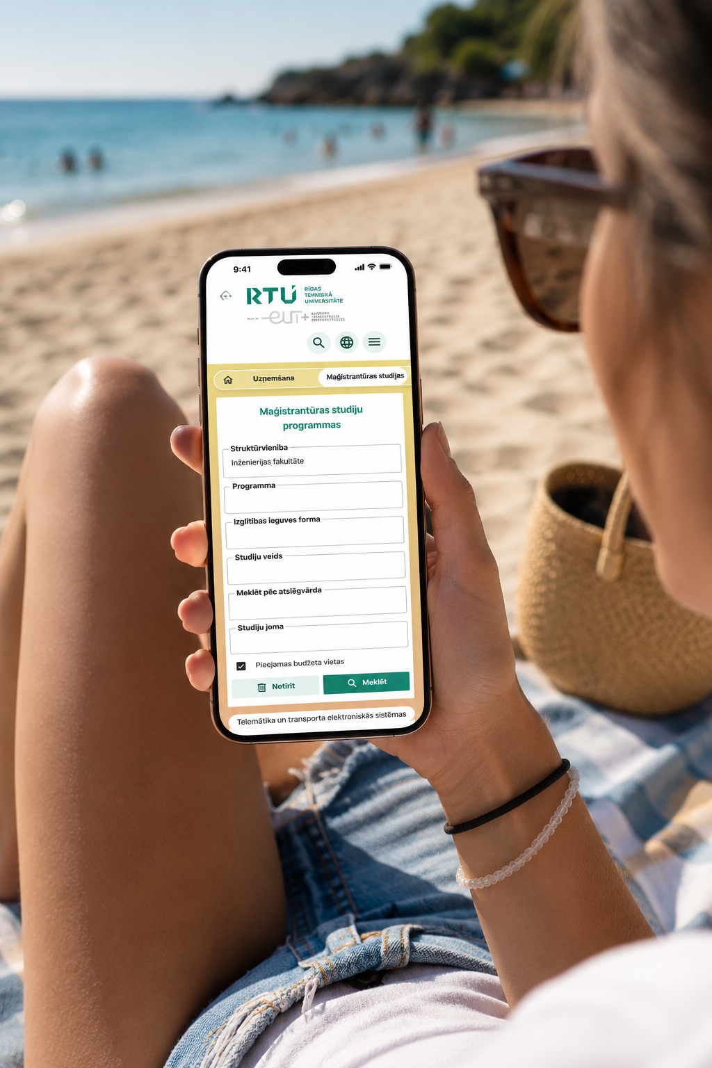
From a generic institutional template to a site with real personality.
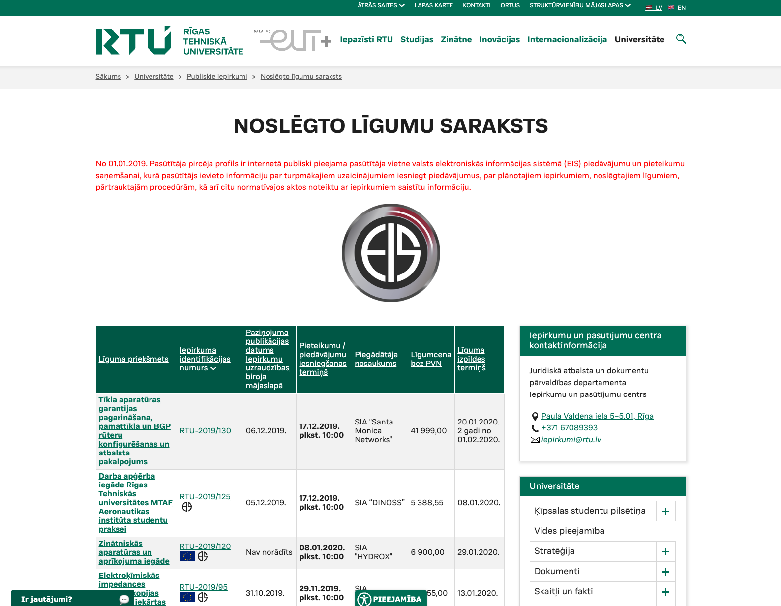
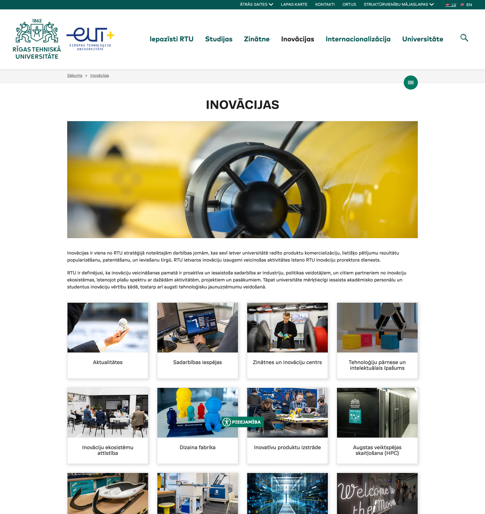
BEFORE
Uniform grid layouts and dense blocks of text reduce scannability, making key content less prominent and harder to locate quickly.
I wanted to get away from unnecessary card elements and unmeaningful pictures — everything needed to be replaced with clearer navigation and genuinely eye-catching content.
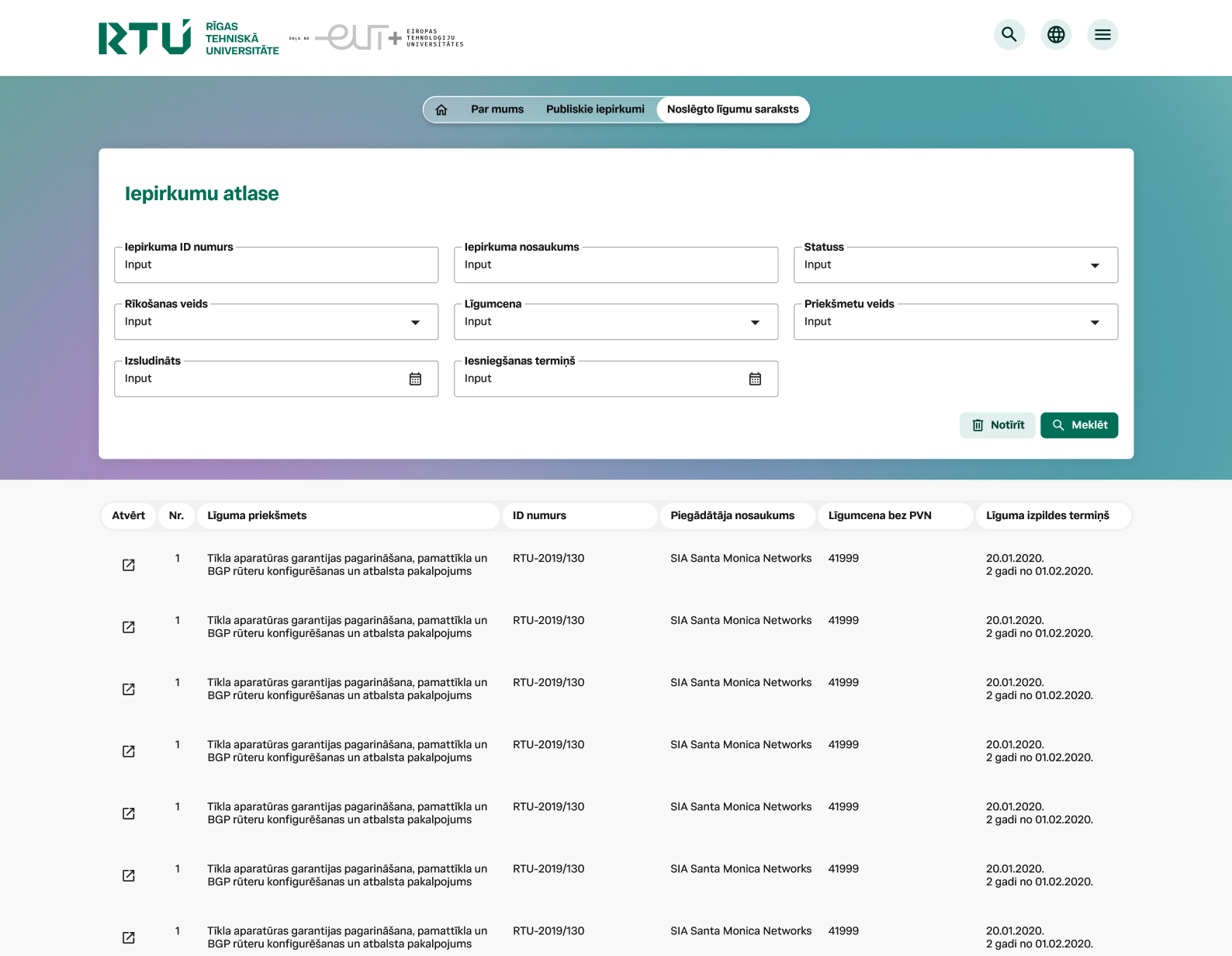
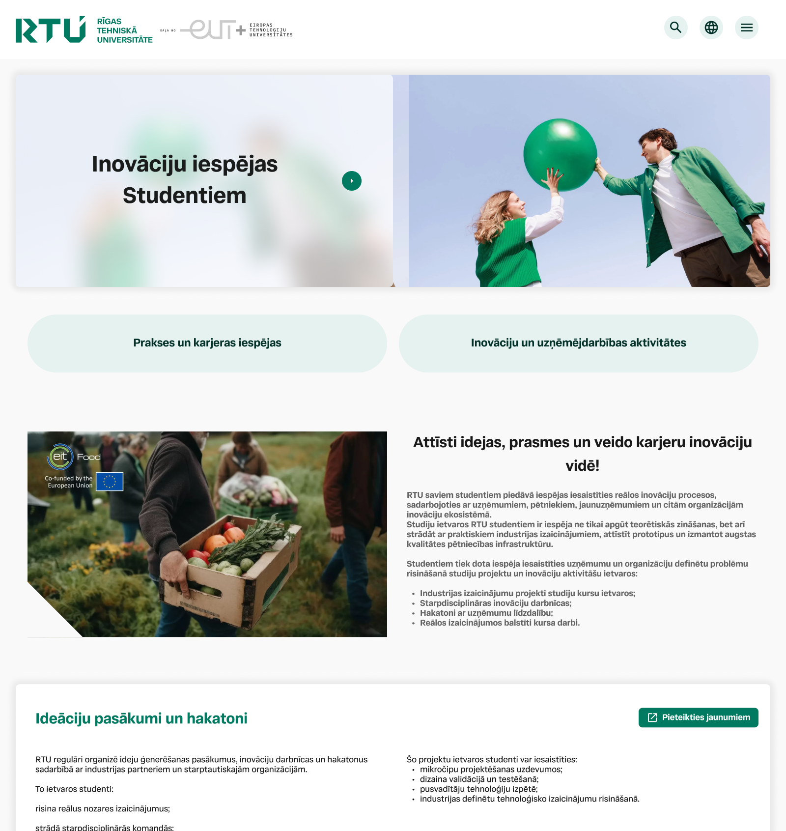
AFTER
Designed with a clear visual hierarchy and a carefully planned user journey to foster an intuitive, engaging user experience.
One of the elements we were keen to include was authentic photography—something that proves trickier than it sounds when you live in a rather overcast, not-so-sunny country.
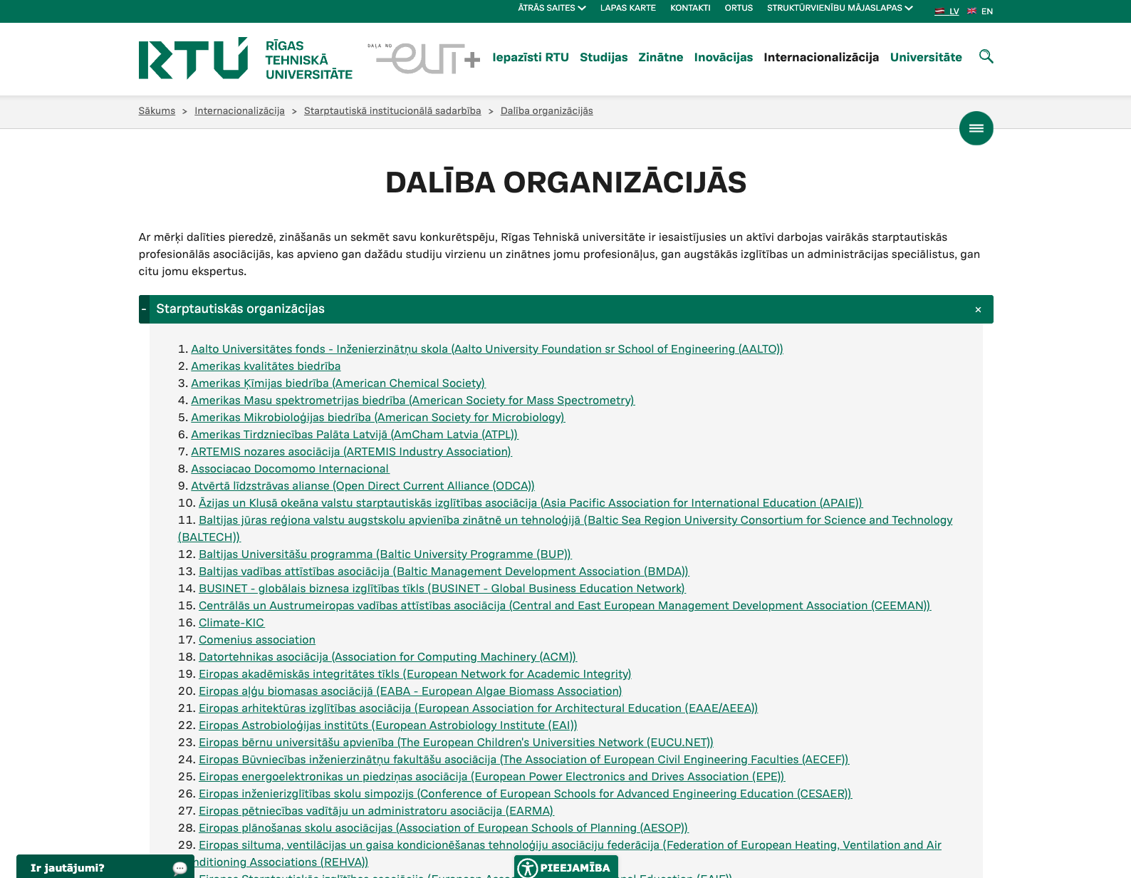
BEFORE
The website we rebuilt looked more like a book. The scannability was low, and the cluttered layout certainly didn’t help the information to be legible. Iterating, on the other hand, was easy — the only thing we needed to hold on to was the wealth of existing content.
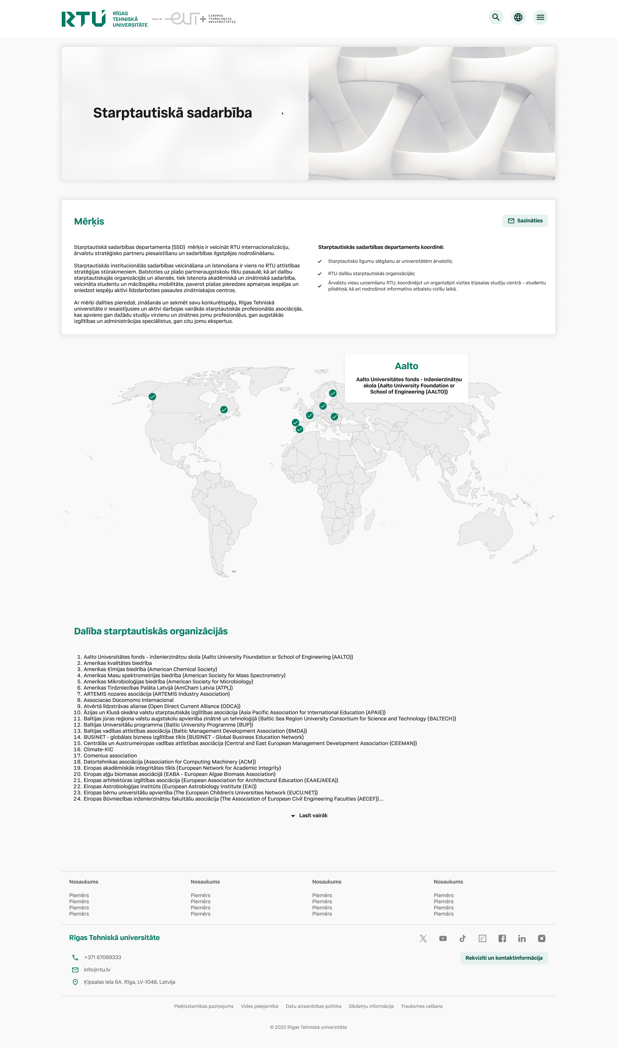
AFTER
Reading’s unavoidable for a site like this, so we teamed with Public Relations to reduce it. We added helpful visuals, boosted interactivity, and made the layout easy on the eyes and pleasant to navigate.
Where the real design decisions happened
Every one of RTU's 500+ pages had its own version of the same fight: too much content, too little structure, and a department convinced their page was already fine. Here's a handful of those fights — and what I did instead.