Student portal redesign
A relic of the 1990s, resented by nearly every student
— rebuilt into campus's most reliable digital tool.
One and only UX/UI designer on the team
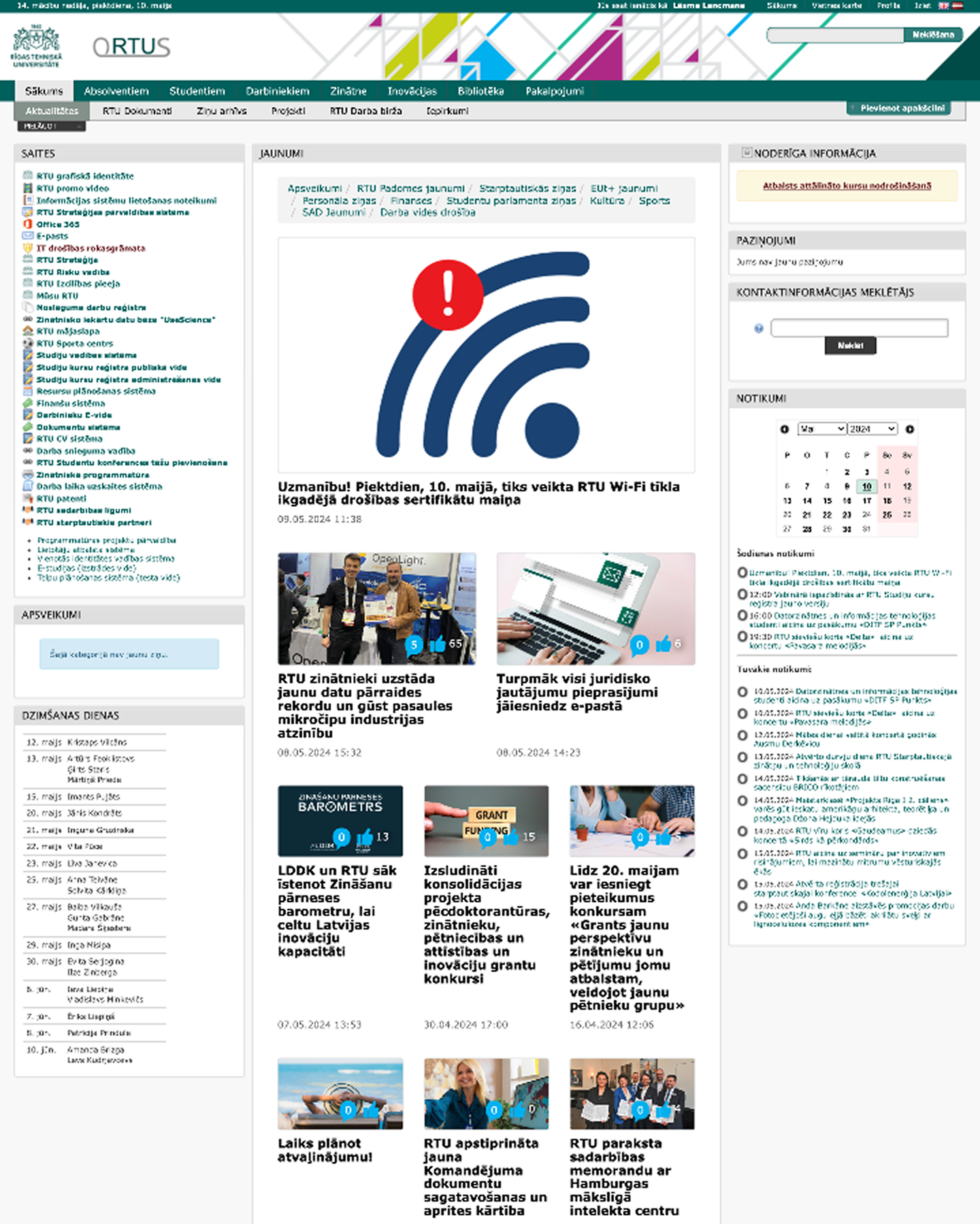
Timeline & Assignment
Aim of the project was to rebuild a completely new Student Portal specifically for the students of Riga Technical University.
Make it separate from the employee portal, since until now both have been bundled together on a single platform.
Simplify students’ lives by developing an intuitive, easy-to-use platform that brings together everything they need for school and is synchronised with other platforms they use.
Discovery — June 2024
Identified student needs through user interviews.
92%
dissatisfied with the legacy system
Testing — September 2024
Launched test environment with focus group validation.
Iteration & Launch — February 2025
Shipped production version, refined from focus group feedback.
Rollout — March 2025
Announced platform-wide, reaching all students via Student Parliament and Career Center channels.
5–18k
daily sessions
Onboarding — September 2025
Ran a live product demo and created training materials to support user adoption.
Continued Communication — October 2025
Expanded outreach through in-platform updates.
10→60%
mobile usage growth
Rebranding — Summer 2026
Reworked the visual identity to align with the university's new brand.
Second Major Iteration — September 2026
Launching the next full iteration of the product, built on the new branding.
Sunset — End of 2026
Retired the legacy system, completing the transition.
2 years
end-to-end as a UX/UI designer
research
•
research •
Discover & Define
To understand how people actually use the outdated portal and identify the key problems the new student portal should solve, I ran live user interviews and usability tests, and deployed feedback forms throughout the project to trace users’ journeys.
0 numeric data to start with
There was no way to research performance scores or session recordings because the portal is stuck in the 90s and nothing modern can pass the system.
455 evaluation forms
With 342 responses in Latvian and another 113 responses in English submitted, this provided a robust and reliable foundation for our research efforts.
50+ interviews in value
After students filled in the forms, roughly 50 of them were ready to join focus groups, eager to contribute featuring live interviews and hands‑on product testing.
The dam was open
As we started with the questionnaire, the feedback wouldn’t stop coming in! We were suddenly swamped with questions and complaints. Students were so furious with the system they were using, we found out that it has become legendary — alumni still remember the ORTUS student portal if you ask them now. So we went from having no data to being buried in it, and all of it needed to be sorted, organized, and carefully examined.
"Can we make long-term/permanent tokens, idk? Maybe something like a “remember this device” button? And maybe, MAYBE let the browser remember both username and password? Or is that too futuristic?"
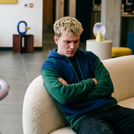
"Not customizable pages... Old UI and terrible UX. You need to login into your account every single 10 minutes!! Even banks have more [security options]..."

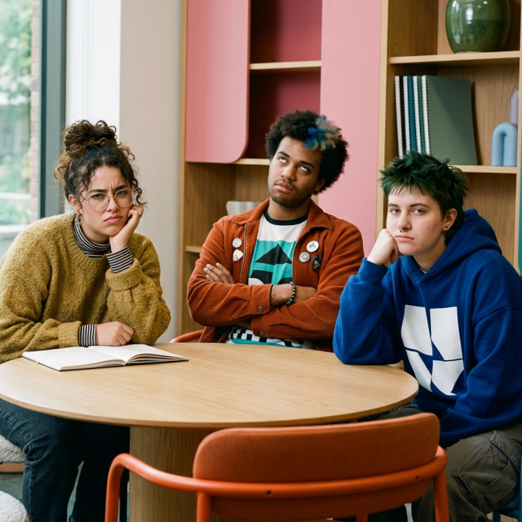
"In ORTUS I get the feeling I'm looking at Excel sheets."
Creating user personas and the user journey
After the submitted forms and during the interviews, I got familiar with the students. They were all so different! There was no way I could make two or three user personas. I settled with nine. Not all of them had different needs, but when I was designing the platform, I kept in mind, it has to be flexible — easy for The Freshmen and enough sufficient materials for Exchange student and Devoted ones. After all, some of them are joining Harvard after RTU and I felt somewhat responsible to help them even if on my part it was 0.001% possible!
ideate
•
ideate •
Framing solutions
Competative research
I researched many apps along the way and picked up some inspiration in color and structure. Especially, I loved the idea of the online diary — or dienasgrāmata, as we call it in Latvia. I was also working as a part-time teacher at the time, so I had the fortunate opportunity to compare the Scholar Portal E-klase for Latvian kids in some detail. What had changed since I went to school and carried around my paper notes? If you forgot your diary at home, you'd get a reprimand noted for your parents to see!
Unfortunately, E-klase turned out to be almost as disappointing as our own solution — which really fired me up to do a much better job on this one!
Workshops
Testing the product with our focus group gave great results! Together we set the right volume cutting back on everything we didn’t need from the old system and added all we did need to the prototypes or ‘‘nice to have’' list on our project backlog to get to it in later iterations.
Soon the new student platform went from colorful draft (because for this project reducing just makes more sense than building up from white wireframes) to minimalistic sorcery.
build
•
build •
MVP
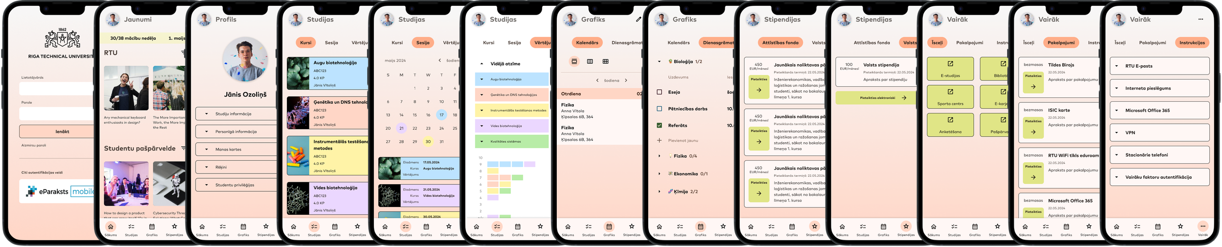
For us, it was important to first deliver:
fix login issues, develop a modern approach;
provide an efficient way to view grades;
offer an easy and mobile‑friendly schedule;
create a new portal path specifically for English users.
While developers were working on the production, I was:
coordinating with departments to plan a full rewrite of the content we want to keep;
prototyping the next pages on the list to refine layout and flow;
keeping our focus group informed with regular updates and gathering ongoing feedback;
and prepping materials and run-throughs for the big demo to present to our colleagues;
getting in touch with Student Parliament and Career centre to spread the word of our product.
While on the first version, we started to create Admin panel as well. Admin roles were set for team members and Library employees responsible for regular updates on posting about online resources.
Posters with news were sent to students group by group starting Student Parliament, Career centre, then faculty members and slowly spread to all students in couple of months.
"Honestly, I really like everything. I especially like that you can customize the entire interface to suit your preferences. A huge thank you for that."
63%
mobile sessions
4.1/5
satisfaction rate
Our colleagues were far more stressed out than we had imagined. During the presentation I was leading, many people raised anxious questions about losing data from the existing legacy portal. Given that we couldn’t afford any mistakes during registration for exams and stipends, we kept the old system running while working tirelessly to test every possible outcome.
But our users loved it! We still got some useful feedback after couple of months but it would lessen a lot week after week. Students enjoyed the new portal and this time we had data to prove it! As the main resource of data I used Hotjar for this project. It provides plenty of data, recordings and I could implement feedback forms for regular check in.
Hotjar data over 30 days in production
evolve
•
evolve •
Rebranding
The new platform was thriving into its second year when I got word that a rebrand was on the horizon. By the time I received the brief, I was already halfway through the university webpage project, having just wrapped up the Student Portal's design system. But as I soon discovered, good things often come from second rounds.
The design system got reinvented — and, like every project before it, the Student Portal received a rebrand. I reworked the hierarchy, reorganized the portal for better clarity, and finally got to implement some long-awaited items from "nice to have" list in Jira backlog. We kept gathering regular feedback from our users, and as their requests began shifting toward more ambitious, complex ideas, I recognized what that shift really meant: I had done my job. I had given them a completely new portal — one that had found its footing, and could now afford to dream beyond readable fonts and timely notifications.
And the journey continues.